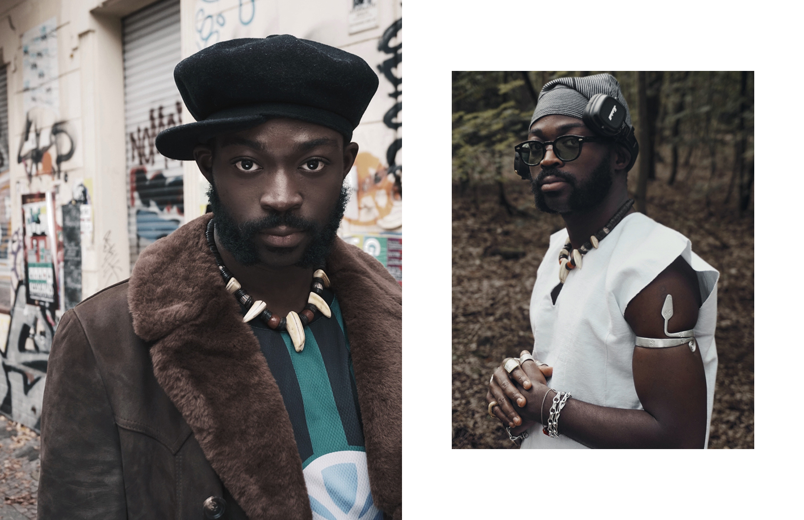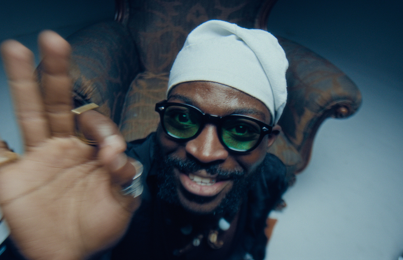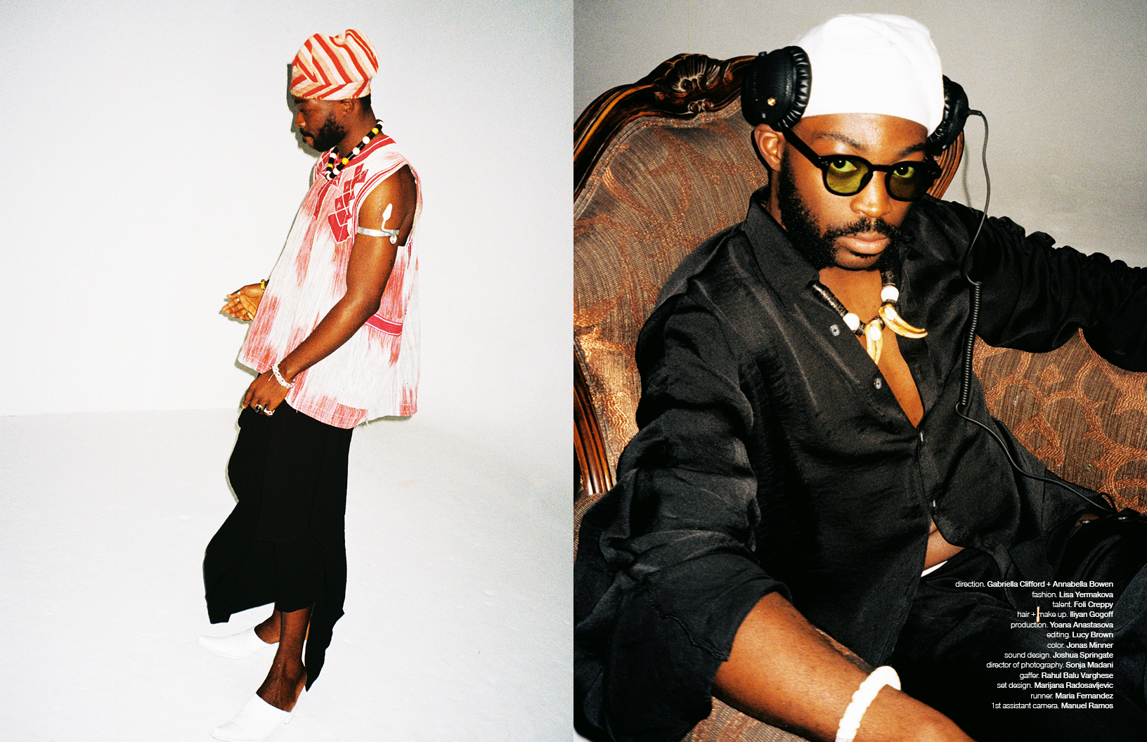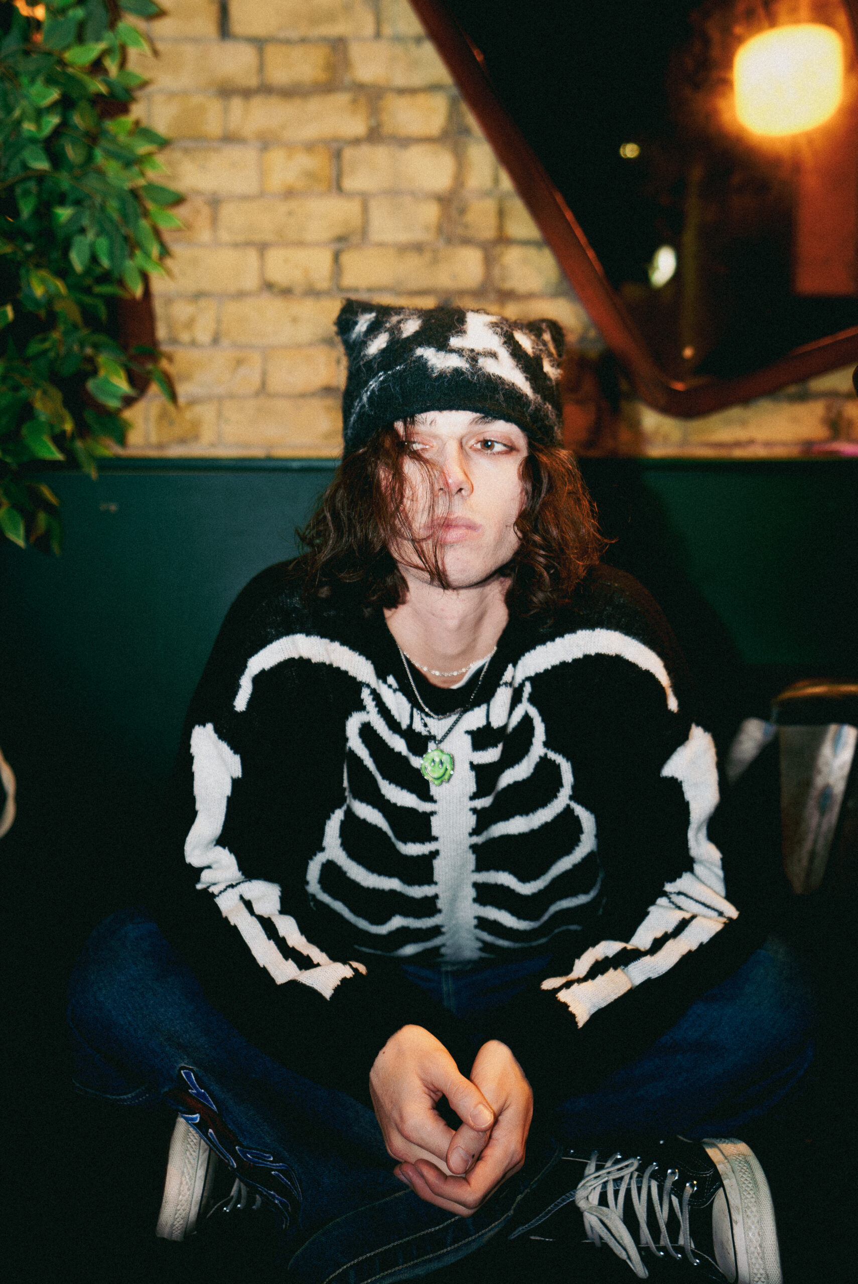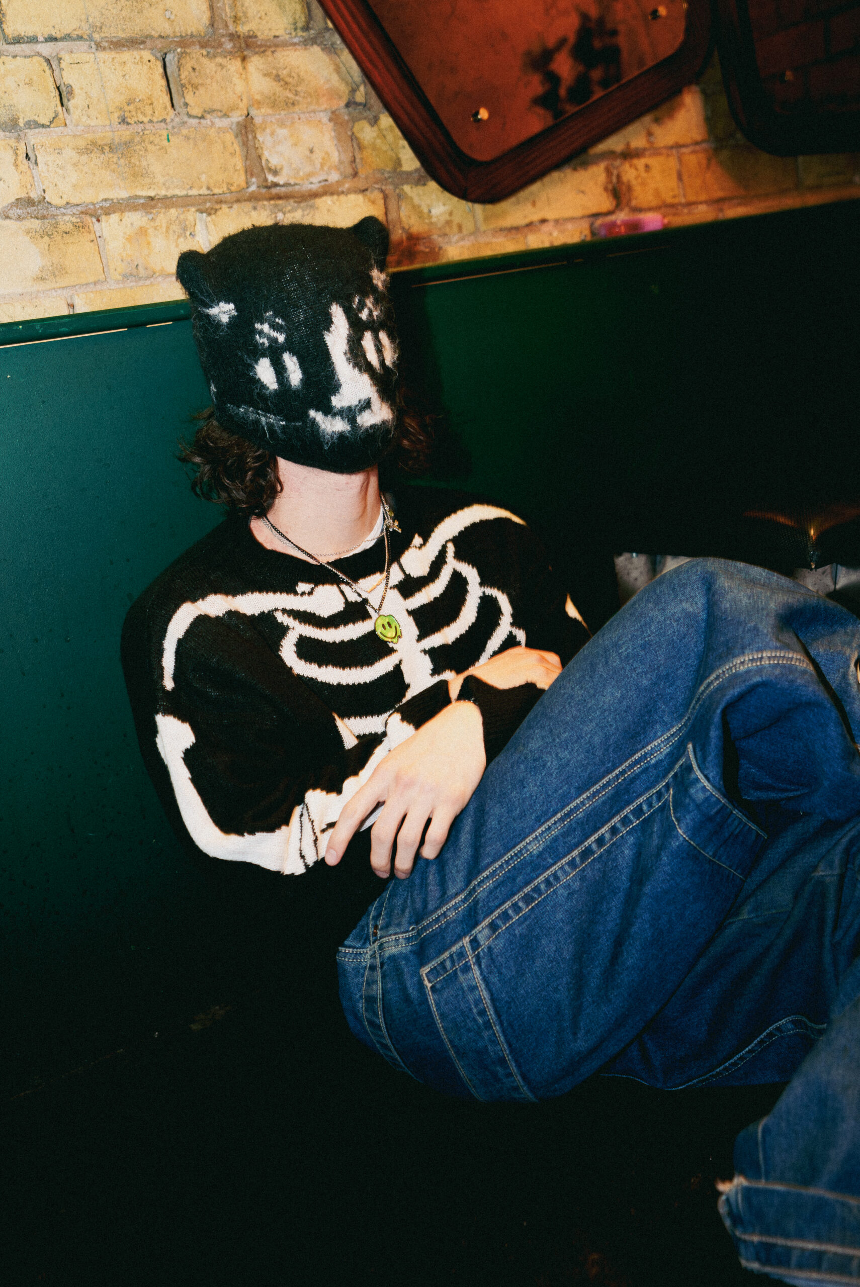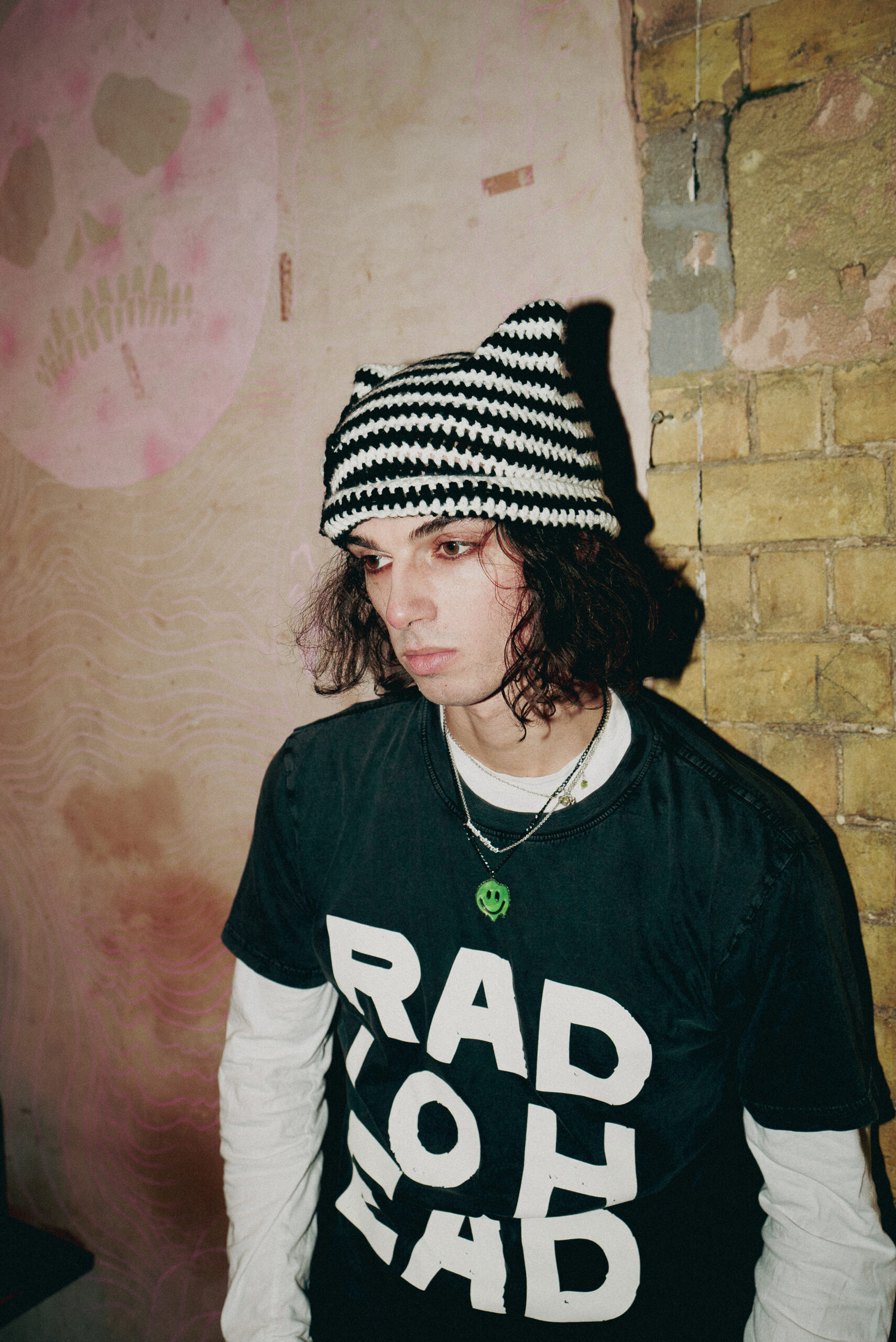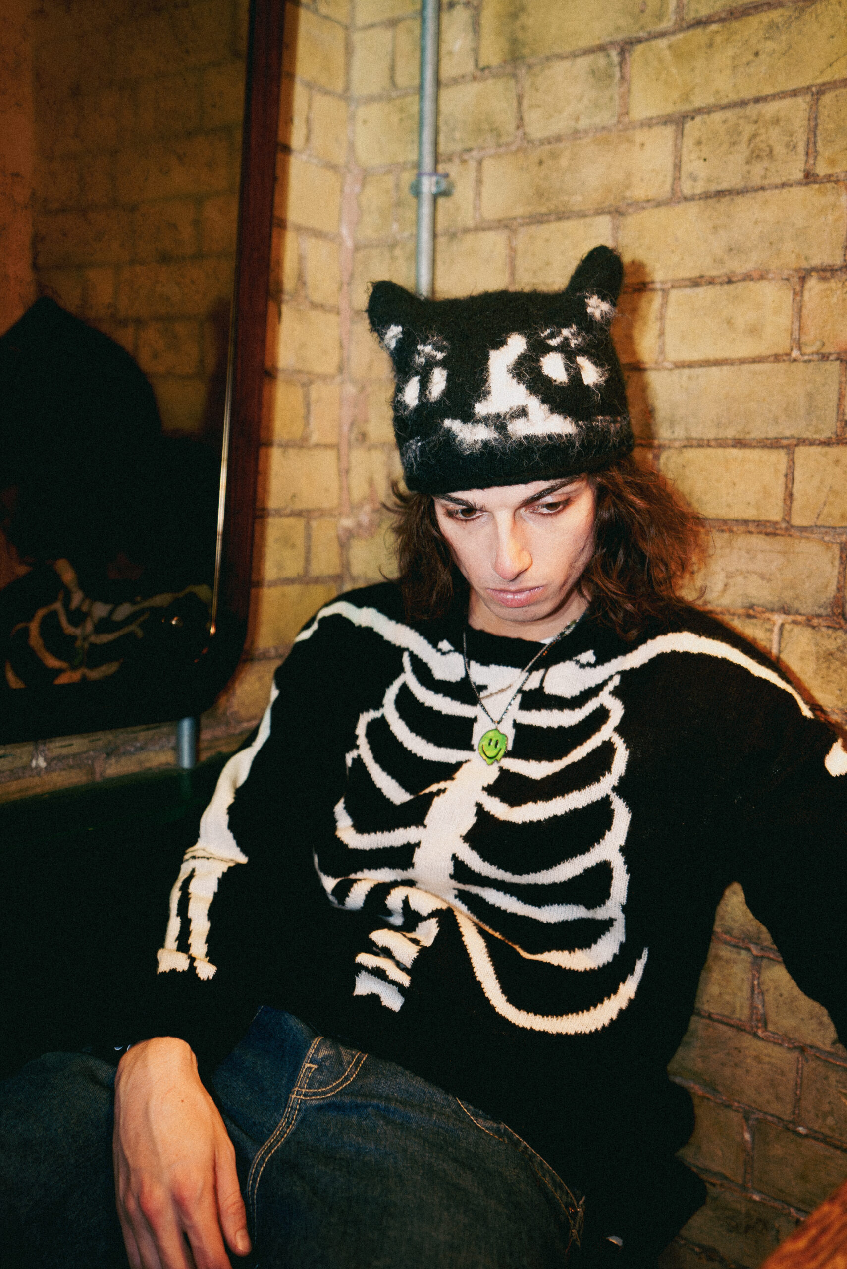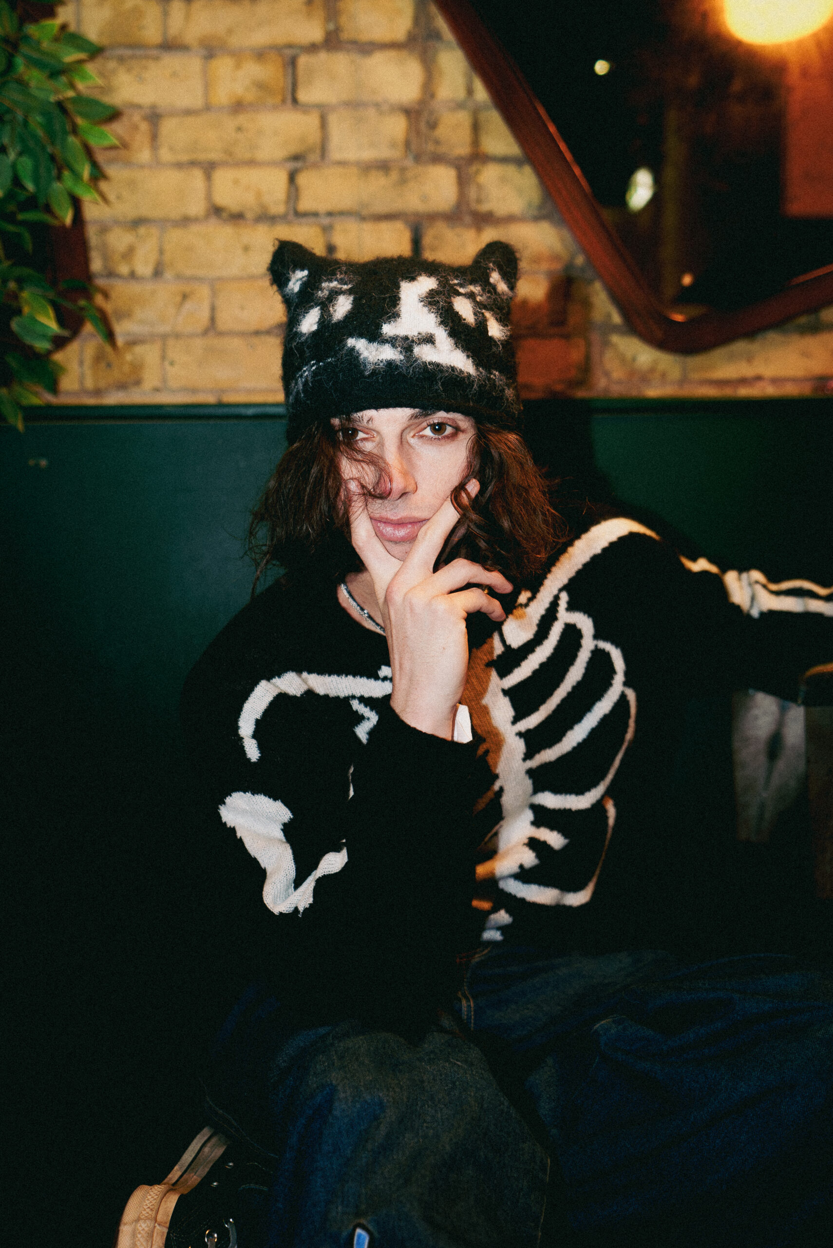
There’s a rare thoughtfulness to Mehro, not just in the way they listen, intently and earnestly, but in the time they take before responding. Each word feels carefully chosen, carrying weight. The pauses between thoughts stretch just long enough to make you reflect, to sit in the stillness – and Mehro doesn’t rush to fill the silence. Thy moves effortlessly between spirituality and art history, quoting poets and philosophers as easily as they speak about songwriting. Still an enigma, but a soft-spoken and tender one, they speak of music as if it’s a living force, something that flows through them rather than from them.
Speaking to Schön! from their home in Los Angeles, Mehro is between two halves of the ‘Weirdthrob’ tour to promote their latest album, which marks a striking evolution in their artistry. “Home,” they admit early on, is more of a concept than a place, an answer that makes perfect sense for someone who has just finished shows across the U.S. and Europe.

Can I just say, you might be the hardest person to research ever, which is lovely cause it leaves me with no preconceived notions at all? All I know so far is that Mehro is an enigma…
I don’t know if there’s a higher compliment than that. I’m going to have to text my mom and tell her that you said that. I can’t consciously recall any specific things that I did to be able to do that, but there must have been some sort of effort because I feel that I wouldn’t want to be seen in any other way than that. I wouldn’t want somebody to be able to find out everything about me in 15 to 30 minutes of research online. So there’s pride involved because what you just said is exactly the way that I envisioned being an artist – letting the art speak for itself rather than letting myself speak for the art.
You say you made no conscious effort, and yet, you have changed your name. I did look up the meaning of the Mehro, and each one I found was incredibly ethereal: a mass of clouds, a rush of rain, the moon…and then here is the way it sounds, like marrow, something deep within our bones. Are any of those coming close to what it is that the name means to you?
Absolutely. The original concept for the name came from the idea of marrow. It was actually an idea that I pitched to an artist who was looking for a name. They loved the name, but they said in their language it means cucumber, so they didn’t go for it. But the name just stuck with me. I love what marrow represents. I just thought the original spelling was too scientific and made me think of something bodily rather than something beyond that.
Names are such a vital part of our persona, and by adopting a new one, I suppose you’re also adopting a new version of yourself, or confirming one that might have been hidden behind some layers?
Yes, I think much of our childhood, at least in my experience, is filled with decisions, actions, and choices that didn’t really feel like me. I’ve read theories suggesting that different spirits enter children, looking to be expressed in certain ways, almost experimenting or exploring through them. Looking back, there are so many times when I think, “Gosh, I would never do that now.” So I think closing the door on that version of myself, leaving it behind, and finding a new pursuit in life through this name allows me to finally tell my own story.

Was there any part of you that felt like you were giving up your family’s legacy by changing your name? You mentioned your mother just a moment ago and seem very close to her, so is that something that you thought about beforehand?
I’m very close to her, I mean, closer to her than probably anybody in the world. Granted, I was in her womb, so I guess that makes sense. I asked for permission from my whole family before doing it. I don’t know what would have happened if they said no. My full name is Mehro Armato-Sturges, and one thing I wanted was for my grandfather’s real name to be part of my name. As I was writing out my potential new name, I kept looking at it, and I was on the phone with my grandmother when I realised that my full name, the initials of it, are my given name – Sam – spelled backwards. I told her this, and she said, “It’s a sign, Sam. It’s a sign. You have to do it.”
You said you liked what Mehro represented. How does that concept translate to your approach to music?
I believe music is a part of people’s lives – it keeps us alive – but we never actually see it, just like bone marrow. If I can be a part of people’s lives through art in a way that has nothing to do with me, then I’ve done what I was meant to do, just as my favourite artists have done for me. My favourite artists make me cry because of the experiences I’ve had, not because of them. You know what I mean?
Yeah, I do. I think there is something so precious about the relationship between an artist and the people listening or engaging with the art. I imagine that, especially being on tour, you get to experience a lot of really visceral reactions and emotions up close. Is that something that affects you?
It does affect me, and something is intoxicating about it. It’s also somewhat of a fantasy, which is nice to live in every once in a while. You get to express your art ritualistically and continuously, and see people’s relationship to your art. That’s something. I don’t know how many other art forms have that ability.
Is there a recent fan encounter that really stuck with you?
There is this wonderful person – I won’t say her name – but her mother bought a sterling silver necklace from the early 1900s, with a tulip in a vase. This person gave me the necklace, and the last conscious conversation she had with her mother, who was in hospice care, was asking for her blessing to give it to me because she loves the song “Perfume,” and she sings it to her mother.

One of my first introductions to your music was through your tiny desk (at home), and I remember being stuck by the fact that it seems like multiple voices were speaking through you, there’s such duality – both lyrically and tonally.
I’m a bit shocked, no, not shocked actually, just grateful that that comes through. I love how anyone can perceive it in their own way, but that particular perception resonates with me because my favourite songs have nothing to do with me. There’s a theory that every song that will ever exist has already been written, and it’s simply chosen. Whoever can tune their instrument – their mind, heart, soul, and spirit – to a certain frequency will find something and bring it to fruition. I believe we’re allowing music to be expressed through us from something beyond ourselves, and I just happen to be the earth suit that gets to take responsibility for it.
How does that belief translate into your creative process? Do you feel like most of the time the songs are already there and you just kind of have to chip away at them until they fully come alive?
The starting point is completely random. There is no process. There is no surefire way for me to get there. Leonard Cohen said if there was a place that he could go to, to write his best songs, he would go there all the time. It just happens. And it can be a chord. It can be a chord progression. It can be a note on a string. It can be a conversation. Somebody could say a phrase that’s so beautiful and so unique that I’ll ask them to hold on for one second while I write something down.
Does that mean you’re the kind of person who has a notebook on them at all times?
Mostly my phone, but it depends because if it’s a late-night experience, I try to stay away from my phone an hour before going to sleep and an hour after waking up. But yes, I do have notebooks and notebooks full of poems.
You look and sound entirely ageless, however, and please take that as a compliment; both the visual language of your music videos, your lyrics, and even the way you communicate with fans on Instagram or X remind me of my Tumblr days. Are you ever hesitant to be that vulnerable online?
Yes, it’s terrifying. It’s terrifying. I mean, you see the artists who came from the Tumblr days, and it was so fantastic.
Right now is a particularly challenging time in music, especially with all the noise, with so many people making music and so much of it being similar. It’s fascinating that there isn’t really a clear place to find music right now. You find music in the same places you find makeup tutorials, comedy sketches – it’s all mixed.
You’re currently touring with your album ‘Weirdthrob’, and while you have plenty of shows still upcoming, you already played quite a few. How has it been to play the album live?
Honestly, I didn’t know if I was going to be able to do it physically, didn’t know if I was going to blow out my voice after one night, be too tired, or not be able to give my all. But that never happened. I had a wonderful vocal coach who helped me through it; her name is Melissa Cross. She’s known as the Zen of Screaming, or the Scream Queen, and she gave me techniques to protect my voice. We played 24 shows in 30 days, and I only got stronger as the tour went on, which was incredible.
Do you have a favourite song to perform at the moment?
“Sewers” is really fun to perform, especially before it came out, and people heard it for the first time at the shows. I love singing “You’re So Pretty” live. “Lady Parts and Mannequins” is always fun, and “Exploding”. But there’s something about all of them – “Ketamine” is one I really enjoy live as well. People are always smiling so brightly when we play that song. It’s fantastic.

We were just talking about vulnerability, how do you experience your concerts and the energy coming from an audience?
I can see how artists might become reliant on a certain amount of energy to get them through a show, but I don’t feel that way at all. What I learned from this tour is that it’s nice not to have to be solely reliant on the energy of the audience. I’ve had the opportunity to play for large crowds and for very small ones, and either way, you have to give them your very best, the greatest possible show. Don’t get me wrong, I’m not a perfect person, I’ve been annoyed by audiences before, but I think that’s probably my lower self coming out.
I cannot let you go today without speaking to you about movies; your love for them might be one of the few things I’ve widely found circulated online. Is it true that seeing ‘Walk the Line’ has been what inspired you to start making music?
Oh yes, absolutely true, that movie changed my life.
Is there a similar origin story for your love for movies?
I have so many memories and experiences with film. I’m so sensitive to the world around me, and it can feel a little isolating when you feel like you’re the only one who feels something so deeply. I would be so deeply affected by art – especially movies – and seeing how other people weren’t affected in the same way made me question myself. I thought, “Is this a facade? Am I just pretending that these things affect me?”
It’s interesting that you were questioning yourself rather than questioning the lack of emotions in others. Sorry, I’m not your therapist…
No, it’s a beautiful point – and every conversation can be therapeutic. That’s actually a very interesting thought, and looking back now at how ‘Walk the Line’ changed my life, it’s proof that I really am affected by art. It literally changed the trajectory of my life.
If we look at artists throughout history, they’ve always been people who are sensitive and in tune with what’s happening around them, so I think you’re onto something there. Do you film in your future, or is your focus very much on music right now?
Absolutely, I would love that. I’ve been auditioning for things left and right, which is so much fun. We’ll see what happens. What’s nice about it too is that people keep requesting me to audition for things, which is so interesting.
In terms of music, my focus is on getting as many people as possible to hear this album we made, and on hunkering down to make sure that this next leg of the tour is just as great – if not greater – than the first. I haven’t played shows in Europe since August and September of last year, so I’m really looking forward to returning.

photography. Payton Abner
interview. Jule Scott
 Rachel Thomas occupies a unique position in the creative landscape. Sitting comfortably in the seemingly limitless artistic space between art director and set-designer, her work spans many media, from installation to print. The visuals that Thomas generates fizz with energy and colour, creating images that are playful but also sophisticated. By questioning these traditional notions of seriousness, she is one of the most innovative and original image-makers of the day.


