“The boundaries of life have many buffered, blurred areas,” explains the designer behind Wang Bo. “These zones have great elasticity. Here, sadness and joy, righteousness and evil, good or bad, have no absolute correctness.”
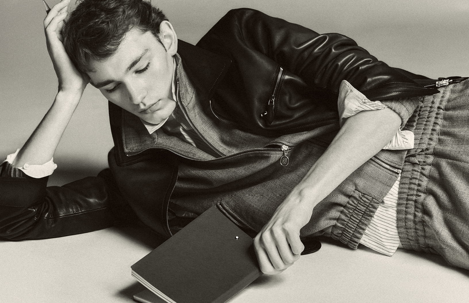
Life is different on the edges. In this series photographed by Zheng Danjuan, designs by Wang Bo cast model Jiang Yan as the comfortable outsider — always finding respite on the edges of society. Taking cues from architecture, psychology and more, Wang Bo’s works are complex, showcasing a deep knowledge of design that goes beyond simple craft. Through these frequently asymmetrical looks, Wang Bo is able to tell a deep and engaging story, all assisted by this series of photographs by Danjuan.
Schön! spoke with the designer behind Wang Bo for more information about these designs and the “boundary effect”.
What is your history as a designer?
I studied fashion design at the Beijing Institute of Fashion Technology in China for four years and majored in knitting design for the third and fourth year. Currently, I am studying in POLIMODA, Italy, for a postgraduate in fashion design.
Can you explain the “Boundary Effect” and how it relates to this collection?
“Border effect” is a social phenomenon that I have observed for a long time. Whether in restaurants, buses, trains, lounges, classrooms or elsewhere, people generally tend to choose the position by the window; in a large square, people like to sit on the flowerbeds around the square or the roots of the walls of surrounding buildings, only sitting around the square when the sides are full and people have to choose the centre. These usual unintentional choices and actions are affected by the “border effect.” The “boundary effect” was put forward by the psychologist Derk de Jonge, who believed that being in the boundary area can see everything around him clearly and expose himself less. I find this phenomenon very interesting, and I want to show it with the knowledge of fashion design that I have learned.
What else inspired this collection?
What inspired this series is an interesting space design, which was co-created by Steven Holl and artist Vito Acconci, in New York. This gallery is located at the corner of a block connecting three different blocks: Chinatown, Little Italy and SoHo. Because the space itself is limited, seeking to introduce improbability and to puncture the facade, Acconci and Holl broke this symbolic boundary — the wall. They inserted a series of hinged panels arranged in the shape of a puzzle. When the panel is locked in the open position, the border disappears, and the interior space of the gallery expands onto the sidewalk. This makes me think that the boundary is variable, and the boundary can generate many possibilities, which also leads to the concept of fluid space.
You mentioned architecture in the background for this series. How did architecture influence this collection, and what did you do to make your designs “flow”?
To continue the above example, when I think of fluid space, I have investigated the work of many architects. I finally found that when the building is undulating, it is equivalent to setting up many boundaries. People prefer to stay in undulating places. They can sit, lean, lie down, and talk, and they will be more attractive than ordinary buildings. Therefore, I used the curved structure and combined the three-dimensional characteristics of the building and the boundary, to design a structural line with fluidity and 3D effect.
What emotion were you trying to capture with these photos? Why?
I want to express the sense of security when people are on the border. Safety is the basic need of human beings. When we are on the border, we can reduce the contact with others, which means that we reduce the possibility of conflict and satisfy the need for a sense of security to keep our distance from others.
How did you work with the photographer to capture that emotion?
I told the photographer the concept of the series. We believe that only simple and clean images can express the atmosphere of the boundary space. Because buildings and spaces are cold, only boundaries can provide a sense of security.
How have you seen your approach to design change since you started?
At the beginning of this series, it was not easy to find an entry point because the “boundary effect” is quite an abstract concept. During long-term research, I put the entry point on architectural design so as to step into the curve structure and fluid space. I think fashion design is a comprehensive subject. The acquisition of inspiration can be in any field. The most important thing is how to use your own methods to transform concepts into real objects. The unique perspective and the novelty brought by the curiosity eyes can also make the whole series full of tension.
What are your plans for the future?
I would like to stay and work in Europe for some years, learning the other brands’ design thinking and methods, accumulate more experience, then maybe go back to China to be a teacher.
Follow Wang Bo on Instagram and Weibo.
photography. Zheng Danjuan
fashion. Wang Bo
model. Jiang Yan
hair + make up. Chen Ping
assistant. Qiu Rui


Schön! Magazine is now available in print at Amazon,
as ebook download + on any mobile device


