


photography. Fran Gomez de Villaboa
suit. Oliver Garcia
shoes. Camperlab
When it comes to colour-coded wardrobes, period costumes, and contemporary touches, costume designer Oliver Garcia is a cognoscente. His impeccable eye for design—whilst truthful to the period and theme of each project—is unmistakably distinctive, contemporary, and engaging. Exploring the inclusion of modernity in his projects, he tells Schön!, “I think a certain level of relatability goes a long way and helps the audience interpret the characters.” Having worked on England is Mine and Soulmates, Oliver has a significant list of projects under his belt.
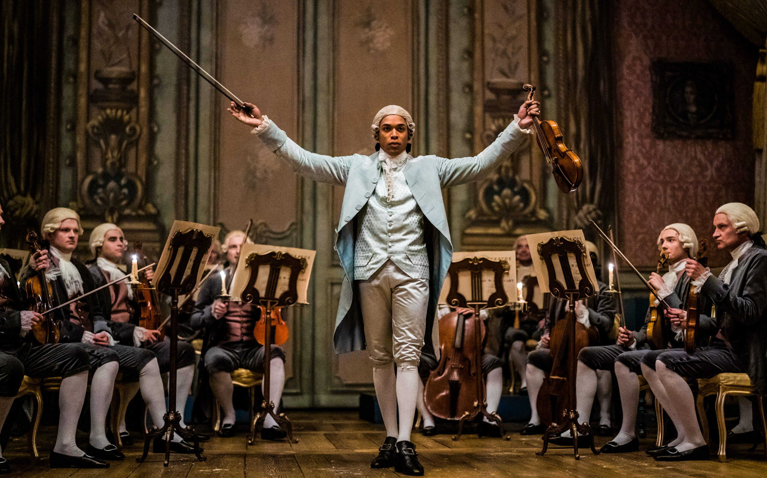
His latest work on Chevalier—a biopic based on Joseph Bologne, Chevalier de Saint-George, the illegitimate son of an African slave owner who rose to stature as a composer in the French Court—is an amalgamation of his talent and experience. From the outset, Oliver understood the care required when creating a historical film set in the 18th century, especially with a story kept in the obscurity of history. Shedding light on Joseph’s story was paramount, and the costumes played a significant role in emphasizing this theme.
In conversation with Schön!, Oliver details the research process, colour-coding costumes, and putting his mark on Marie Antoinette’s legacy.
Firstly, I want to congratulate you on your newest film, Chevalier.
Thank you! When did you watch it?
I watched it two days ago and it was incredible—the costumes blew my mind! What is your starting point when designing for such a large project with so much opulence?
We always start with the script, pretty much, it’s always just the script. It’s quite important to read—to analyse—the text because that helps you become familiar with the story and the characters quickly. Once I feel like I kind of get the essence of all the characters, I start doing my visual research which informs the opulence that you are referring to. I guess the research is the most fun part of the process because it’s like this creative journey where you have no limits and you learn and discover new things. Then, those new things develop into the costumes that you’ve seen two days ago! [Laughter]
Talking about research, with it being a biopic set in the years leading up to the French Revolution, how much research did you have to do to ensure the costumes were historically accurate? Where did you source your information and inspiration?
The years leading to the French Revolution are quite interesting actually. I mean, I was a little bit familiar with the 18th-century costume from past projects, but in order to design my own version of this particular period in history, I did have to do a lot of in-depth research. A lot of it was focused mainly on the two artistic movements of the times which were the Rococo and the Baroque, so I just gathered a lot of visual references which range from paintings and sculptures to the fashion that you probably are familiar with from that period. With all of that, it sort of gives me a really good understanding of not only how the clothes look, but also how they were made and how they moved with the body. I mean, I just looked through books, online, and museum archives, and I had the opportunity, as well, to look at existing garments from a private collection. And all of that is just very informative and enriching. But I would say, the main source of inspiration—because one thing is the clothes and another thing is to give a vibe and a feel to the film—pretty much came from the colour palette that is in the Rococo art. We just felt like the freshness and that luminosity seemed a perfect fit to shine a light on the story that we had.
When you were designing, where did you draw the line between period costumes and adding your own twist and modernity?
All costume designers want to be truthful to the period, especially when you’re dealing with a historical figure. But, at the same time, movies are products of these times now, so they have to appeal to modern audiences; we’re not doing a documentary. So, finding that balance between the two is quite a challenge. I mean, I did my research, I studied the research, and then I just designed costumes with contemporary sensibility and mind. But, I was definitely influenced by contemporary fashion because I think a certain level of relatability goes a long way and helps the audience interpret the characters.
This is something I’ve always wondered: do you use the same techniques as they did in the 18th century when designing garments? More specifically, were the ‘robes à la française’ that the women wore shaped with similar corsets and panniers, or was there a modern approach to creating the same shape?
All the costumes we created—which is pretty much 85 per cent of what you watched—are all historically accurate for the period. To create those silhouettes, we used the correct corset shapes, the panniers, and the correct underpinnings. So yes, just respectful and truthful to the research that we did. I think the modern comes in through the design approach because early on, I made the decision to keep the surface decorations of the costumes luxurious and minimal (if I could say that) and just use colours in a way that is more in tune with contemporary fashion sensibility. I kept thinking of Tom Ford; our production designer came up with the idea of doing the 18th century à la Tom Ford, which has that sort of minimal luxury feel to it. The director, Stephen Williams, was very clear as well, from the beginning, that he wanted a modern-looking period film, so I guess this approach felt right.
You mentioned the colour palette, and throughout the film, Joseph’s primary colour palette is powder blue. What does the colour represent?
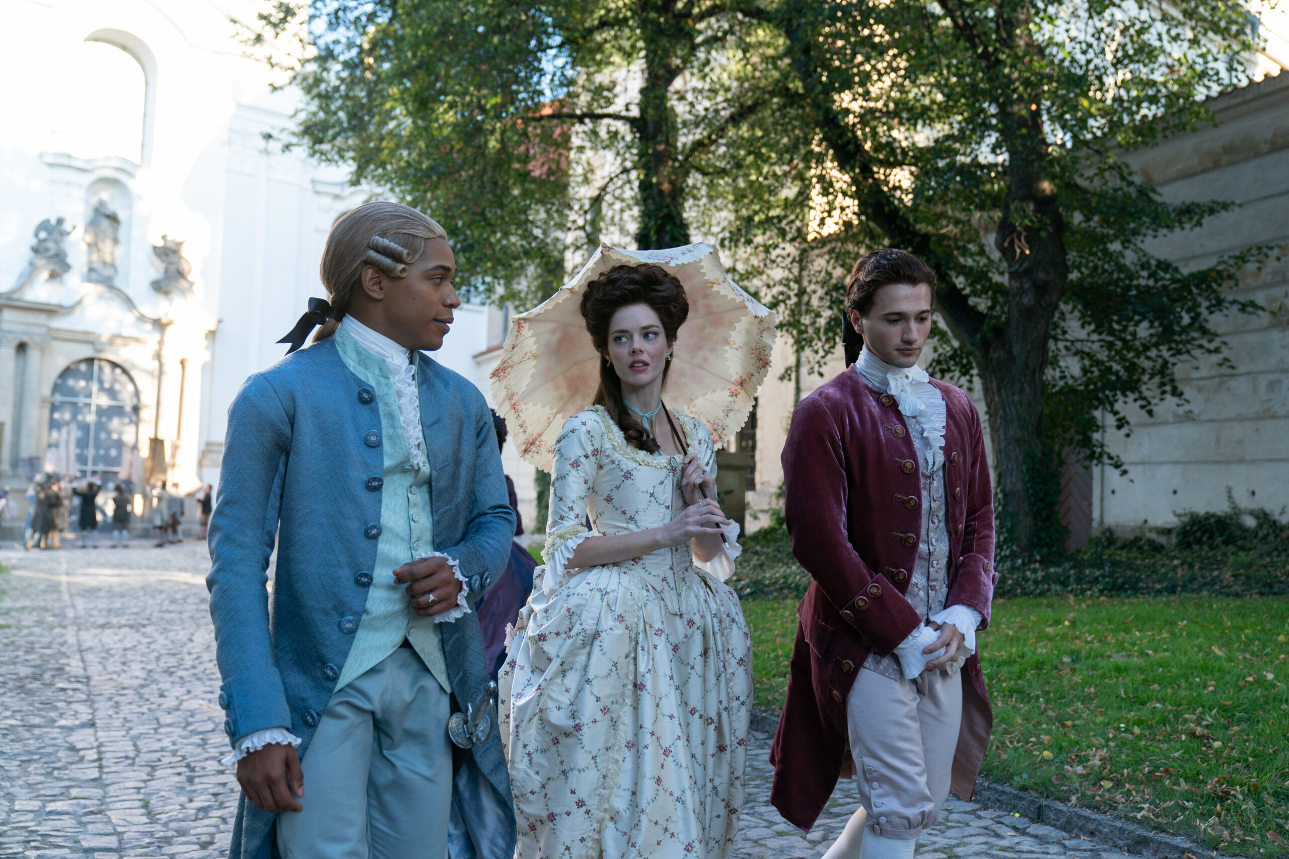
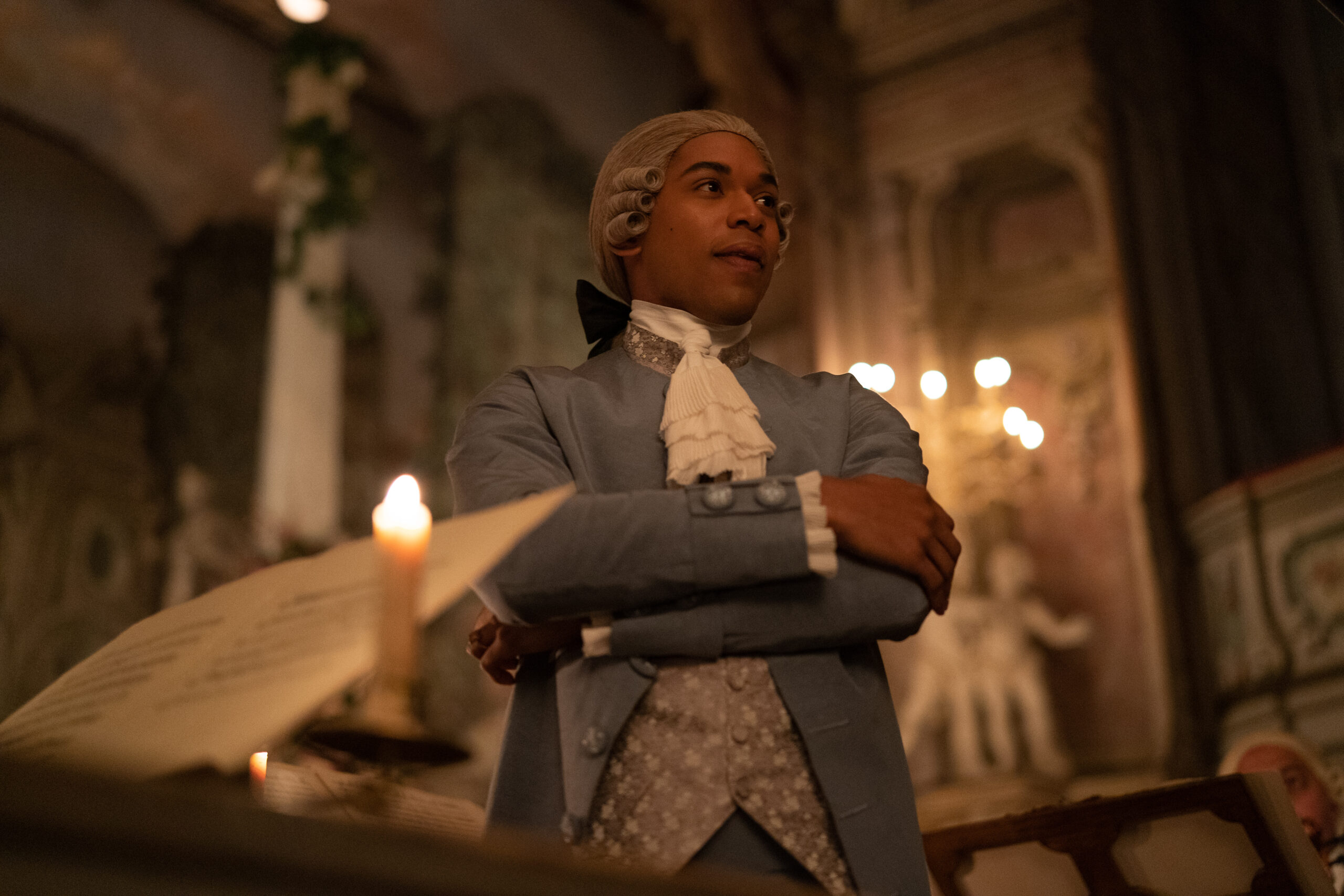
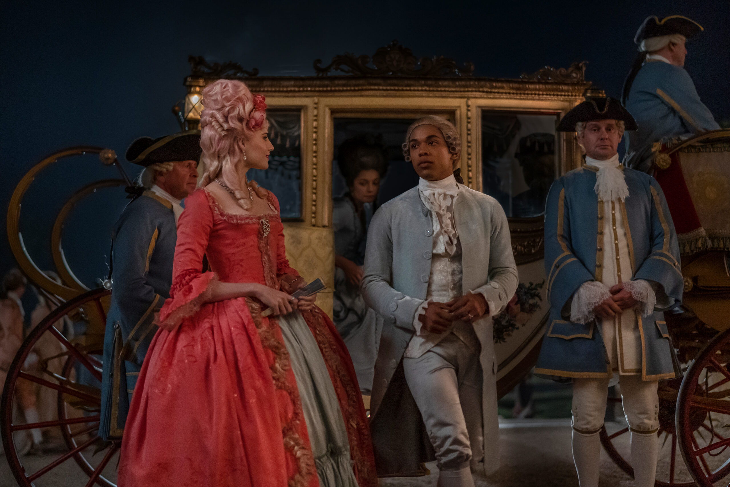
There are various reasons why that powder blue is Joseph’s main colour. Firstly, it is the colour that is recorded to be one of Marie Antoinette’s favourite colours, so it made storytelling sense to use it for Joseph because it’s like his tool for social acceptance within the aristocracy and the French Court. It’s almost like a uniform that he needs to put on to be able to exist and flourish within that racially unjust society that he’s in. And then secondly, it’s a very visually peaceful and calming colour and that helped define the character. It also looked great on Kelvin’s skin tone. He shines wearing that blue and it just felt right for the character. It’s a character that’s been in the dark of history for centuries and this was our time to put the spotlight on him and that light reflecting quality was very interesting to use.
When the downfall of the Chevalier began to take effect, his wardrobe and colour palette changed. Why was this an important change to make?
It’s very important because it’s like two different stages of the character, so it was important to visually set the tone of the shifts in the character’s trajectory. It’s a social and emotional change as well, so, during the first half of the movie, he’s almost always looking for acceptance. He’s trying to fit in and please others, and he adopts the colours that were in fashion and accepted by society at the time. During the last half of the movie—which is what you’re referring to—he’s no longer looking for that approval, he’s in this self-acceptance mode and he embraces his cultural roots and becomes a part of the African community. So, the colours that he wears reflect that. You probably noticed, as well, that to close the film—the final concert scene—Joseph wears purple, a soft purple, and that was a nod to Prince, who was an inspiration for Kelvin and Stephen. Prince was an artist with great style, swagger, and stage presence, and that was a constant reference for Joseph Bologne. Did you notice that?
I did notice the purple, yes, and I noticed that visually, there was such a shift in his wardrobe after he was ousted by Marie Antoinette.
I introduced that politely. I don’t know if you noticed, but when he composes Ernestine opera, at the opening of the opera when you see the flower dress, he’s already wearing a very pastel version on his waistcoat of that purple, but it takes full-on effect at the very end when he is on his own and he’s embracing his own culture.
Did any of the other primary characters have a specific colour palette? What did the colours represent?
This was a job that was pretty much a colour-coding type of design job. So yes, they did. For example, Marie Antoinette is dressed in ivory, gold, and silver for quite a few scenes and they represent her regal status and her wealth. She wears pink when there are more playful and fun scenes, and the colour that we’ve been mentioning, the pale blue which runs through the movie, symbolises her femininity. This colour is historically attached to the Virgin Mary, especially at that time, but it’s also sort of like loyalty to her country because blue was a very French colour at the time. Colour is one of the best storytelling devices that we have in movies and the audience has an instinctive response to it, so it’s great to take advantage of that as much as you can when you’re designing for movies.
There were so many beautiful and intricately crafted costumes throughout the film. Which character’s wardrobe did you have the most fun with?
All the characters were fun to do, but Marie Antoinette’s wardrobe was one of the most satisfying because it’s a character that has been portrayed many times before and a lot of us are familiar with her. So, doing my own version—and hopefully adding to her legacy—was fun and just very rewarding. She also has a lot of really nice jewellery and that kind of elevated her wardrobe which made it a lot of fun. We also had three different Baroque operas within the film and those were very fun to do too. We shot those in a real Baroque theatre in Český Krumlov. It’s hard to say which one is the most fun, but yes, I’ll say Marie Antoinette… And the flower dress of the Ernestine opera.
Yes, I was going to say that the flower dress was probably the most memorable gown for me.
It is! A lot of people say that.
How did your previous projects help prepare you for Chevalier?
They help you with the things that you learn. You know, everything you’ve learned in previous jobs helps you when you’re designing something new. I’ve been very lucky to work in some wonderful period films and with very talented people, so I guess that experience has built my confidence, my knowledge, and the design skills at my disposal. Also, most of my background has been in period films, so that’s a bonus help.
What kinds of projects would you like to work on in the future?
I’m very attracted to fantasy, sci-fi, and period movies because of their aesthetics and the creative reward you get from designing them. So, I would love the chance to carry on within those genres, but ultimately the story is what’s the most important. If I read a script and I like it, and I get along with the director—which is important—no matter what genre, then I’m in.
Chevalier is released to UK and Irish cinemas from the 9th of June.
interview. Amber Louise

(副本)-447x390.jpg)