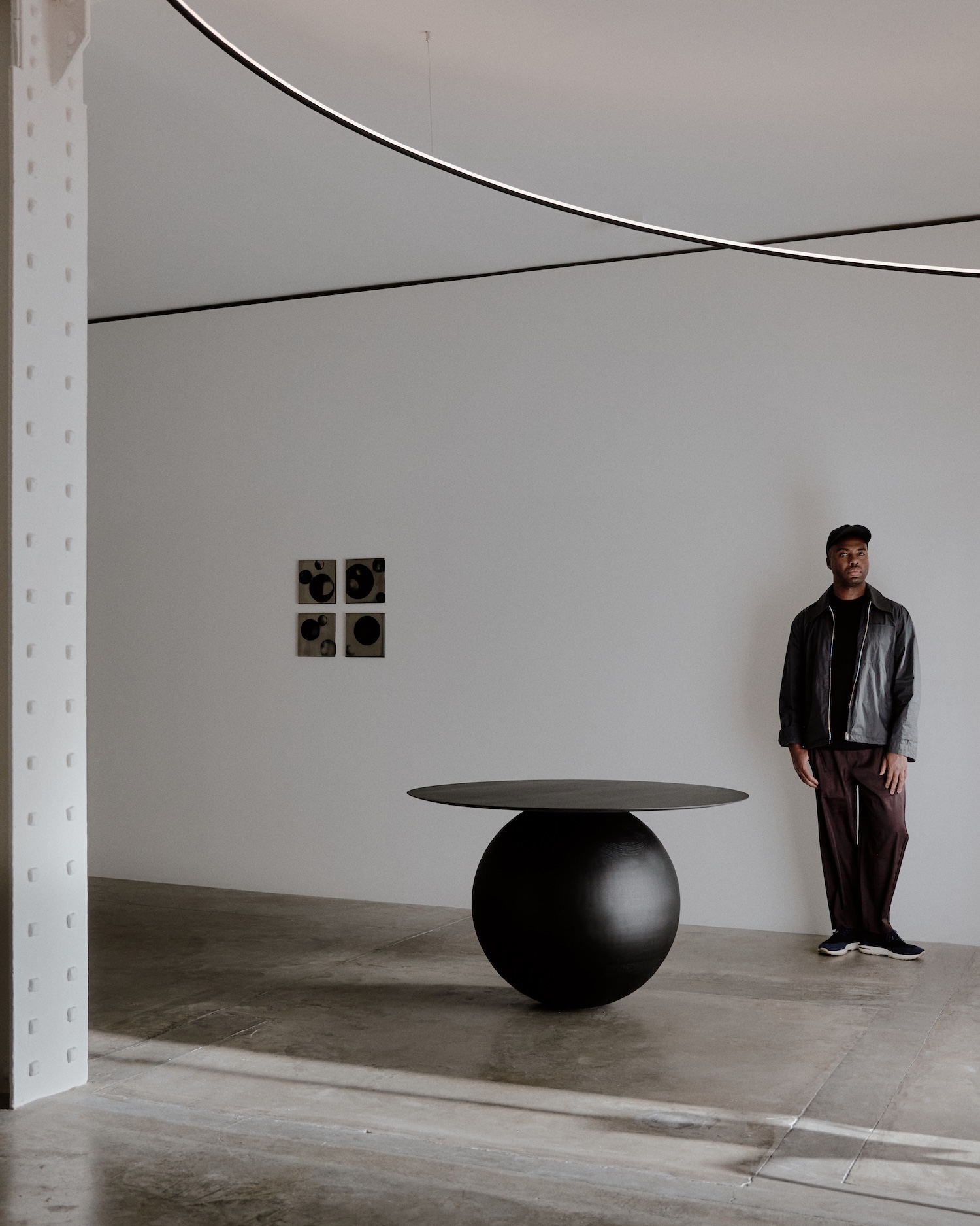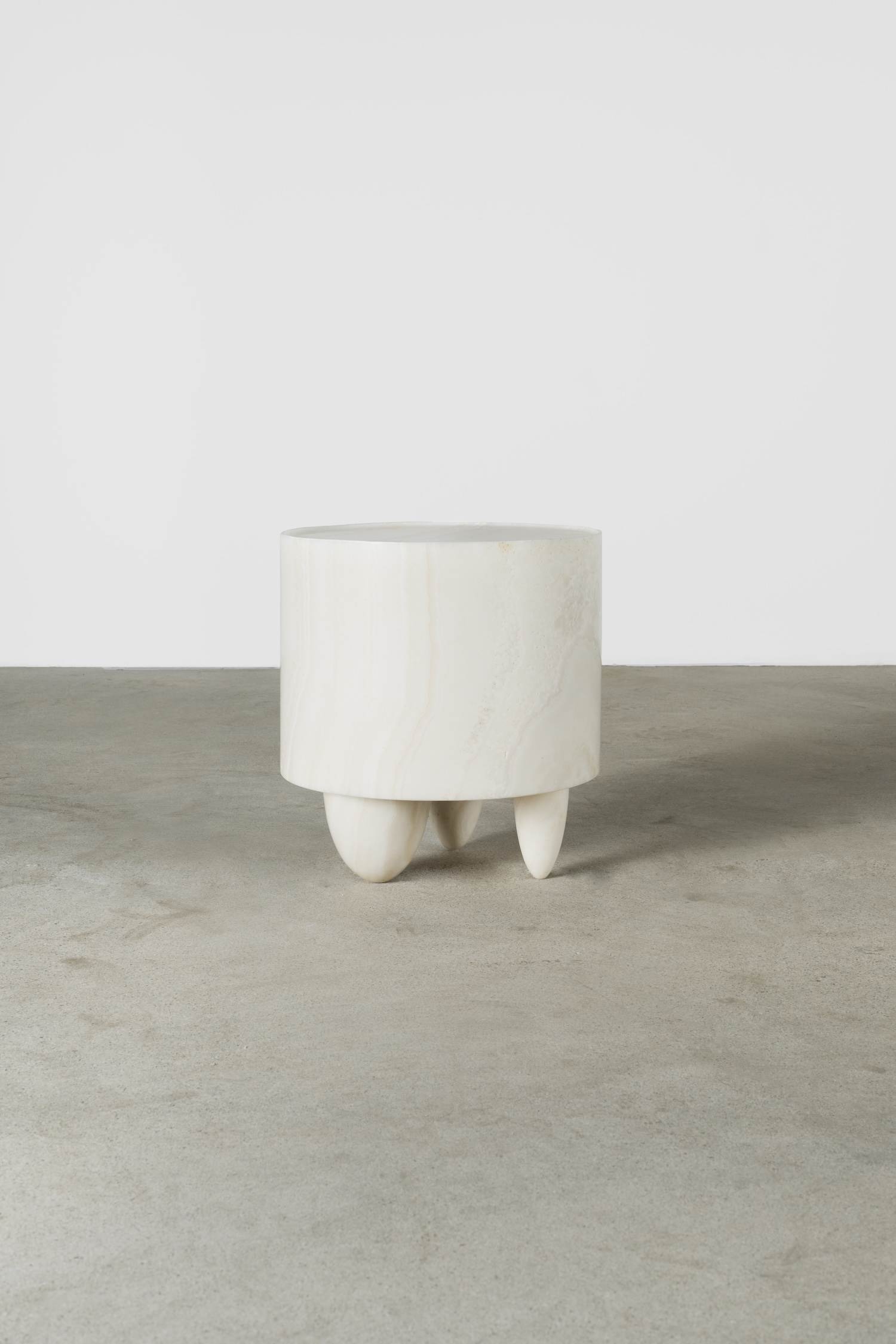
Housed in a vast venue in the heart of Paris designed by spatial designer Emerzon and architect Midori Hasuike, an incredible curated collective of talent showcased their oeuvre during Paris Fashion Week. Completely comprehensive, this exhibition featured creatives who excel in many visual arts, including a photography showcase accompanied by an interior design exhibit and the debut of a new IKEA collection packed with super playful home decor.
The primary photography showcase, Life At Home IKEA+, featured images by renowned photographer Annie Leibovitz, exhibiting 25 photographs depicting people in their homes across different cities around the world. Annie also created a mentorship program leading six up-and-coming photographers who were all assigned the task of capturing friends or family in the intimacy of a familial residence, each mentee contributing unique and thoughtful storytelling to the project.
Based on feedback from a Life at Home report that stated that 48% of people globally did not believe that their life at home was reflected in the media, the ‘Life At Home’ project was also incepted. Before this report, an authentic portrayal of the average person’s home living was not represented — and while architecture and design is beautiful to market and showcase, creating a more personified presentation with human subjects occupying realistic spaces conveys more accurate and relatable storytelling for IKEA’s consumers.
“We’re really particular about being close to people at IKEA. We have this close relationship with people and we’re really curious about them.” says creative director Marcus Engman. IKEA indeed uses an inquisitive approach, always prompting and listening to its customers is part of the company’s core ethos. “This is more of a design collaboration; it’s actually solving a problem, like design thinking, no matter if it’s photography or real design,” says Marcus.


Alongside the photography showcase was the work of students from Casa 93, an avant-garde design program named after the Parisian neighbourhood where the program was created. This exhibition featured the work of six designers who created intimate interior vignettes which all employed IKEA products. With the guidance of home furnishing mentors from IKEA, their innovative thinking was challenged through using mundane home items — utilising everything from rugs, pillows, stationery, and kitchen accessories, each spatial showcase was distinguishably designed and beautifully exhibited each student’s visual ethos and design thinking.
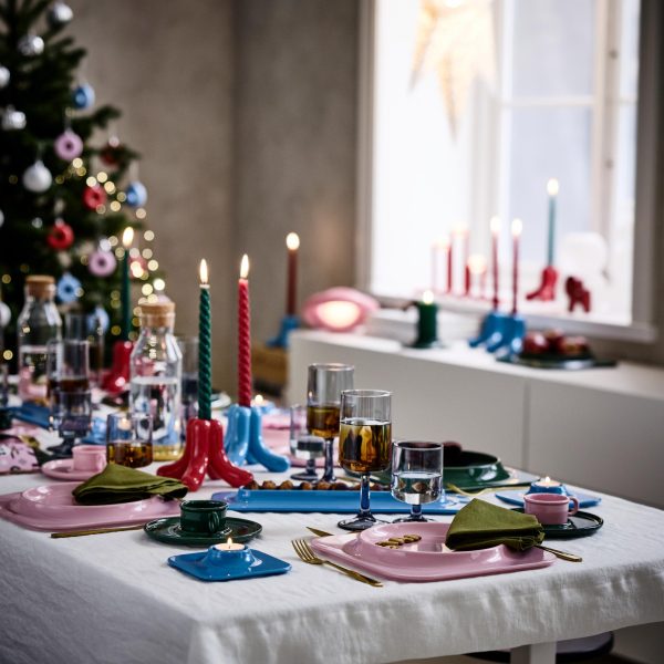
The third showcase debuted a new IKEA collection called TESAMMANS, Swedish for ‘together.’ IKEA collaborated with Dutch design duo Christoph Brach and Daniera ter Haar of RAW COLOR, an interdisciplinary design studio that provides services like photography, graphic design, and much more.
TESAMMANS is a product assortment of 18 playful polychrome furnishings and accessories. Permeated by immense colour, the collection also emphasizes colour harmony. For the design duo, form follows colour, and their visual language is also enhanced by their interdisciplinary skillset, incorporating a graphic design-oriented element while also crafting the collection through a photographic lens.
The products are sourced and developed with an economic and ecological approach — crafted using various materials such as ceramics, textiles, and metals. Each item is strategically designed to utilize only one material per product, allowing the items to be more sustainable and possess longevity. The duo also specialize in being universalists and creating products that are accessible and can be used by all.
From initial shape studies to paper prototypes to tangible execution of the collection, Christoph and Daniera stress how imperative collaboration is and that sharing knowledge is key, continuously revisiting the concept of ‘together’ and how its always an ongoing design dialogue.


The TESSAMMANS collection will be available online and in IKEA stores on April 1st.
photography. IKEA
words. Tiffany Harrison


