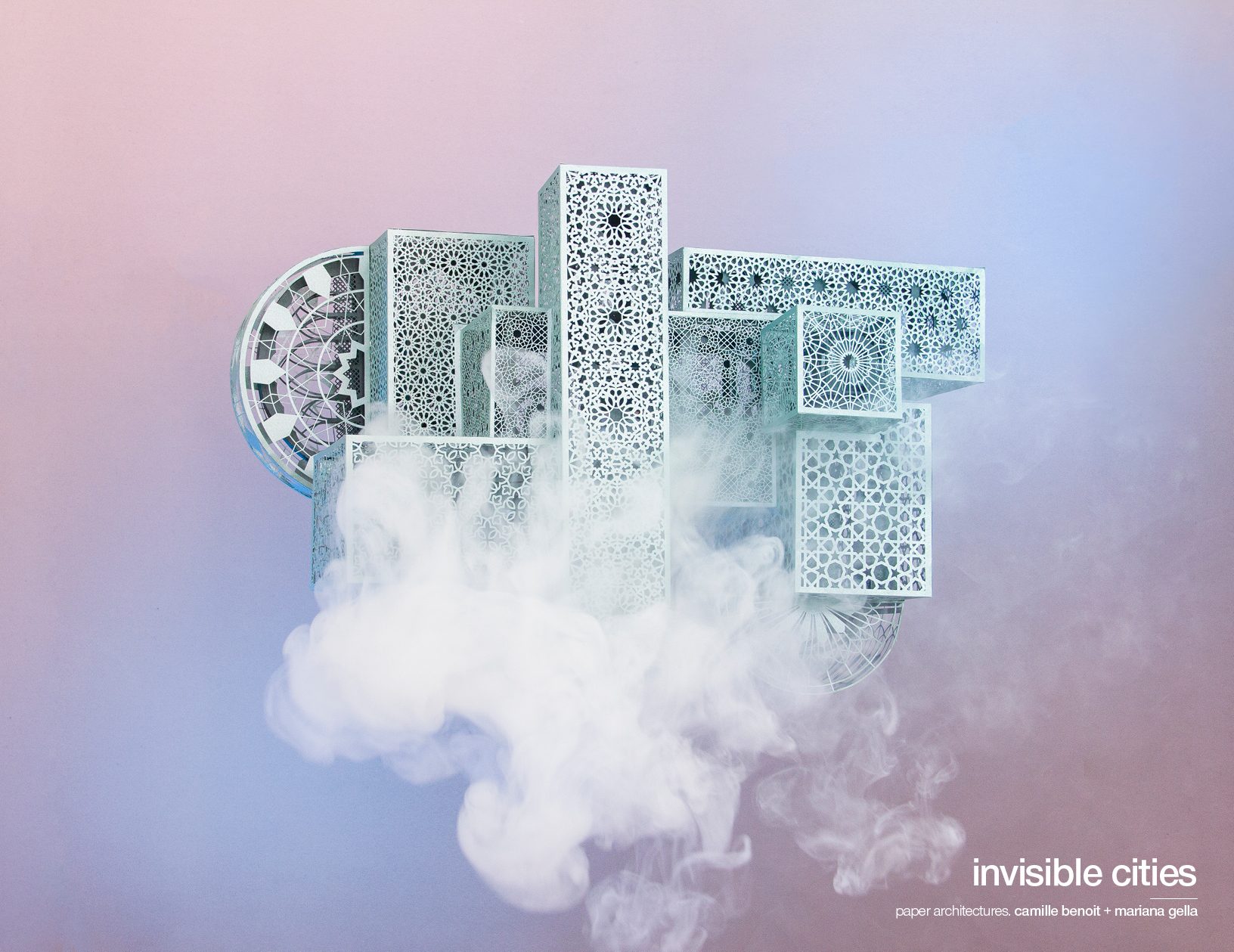
Though completely necessary, lockdown was mostly a drag for everyone. Camille Benoit and Mariana Gella, however, saw it as a respite to finally realise a project they’ve long dreamed of. Taking all sorts of influences from a variety of places — mostly Italo Calvino’s Invisible Cities but also Rachel Whiteread’s sculptures, Buena Vista Social Club’s music, Jules Verne’s drawings, and many more — Benoit and Gella created four models of fantastic cities that combine their skills as art director and architect, respectively.
The cities themselves are colourful, intricate pieces of art that allow us to travel again while we are still more or less stuck in our homes. Benoit and Gella hope viewers are inspired to dream and look at the cities that we do live in with a new eye. Read on for their detailed answers about inspirations and processes in their talk with Schön!
To introduce yourselves a bit, Camille, what’s your favourite part about working with paper in making sculptures?
I have a long-held passion for paper and the plethora of differing textures fascinates me the most. It began as I started discovering the wide range of paper printing techniques used to create luxurious books – something I later explored during my art direction studies. Little by little, I incorporated more and more intricate cuts into the paper and started to learn new techniques such as pop-up folding and origami. After my studies, I had the chance to be properly initiated into the paper artist’s craft and discovered a world in which this material is king. The diversity of colours, textures, weights, and sizes allows you to create adventurous personal projects or respond to an individual client’s specifications.
Paper is a raw and versatile material that allows you to create both architectural and organic elements. While mastering a wide range of equipment may improve your overall efficiency and speed, it is possible to create using only a simple scalpel and sheet of paper. This makes paper a practical medium that allows a huge range of possibilities. Moreover, to see the reaction of the spectator as they realise a project is made only of paper is always a special moment. The incomprehension is magical.
Mariana, how does your study of architecture factor into smaller-scale projects like jewellery work?
Studying architecture has provided me with the tools to work at any scale and understand materials. When working on large projects, the tasks are usually divided into teams, and you end up controlling only a small portion of it. However, in jewellery, I was in contact with every step of the process, which is highly satisfying, because it allowed me to understand the final product better. The smaller the scale is, the more control you have on the final product.
The steps for every project I have worked on are usually quite similar: research, sketching, computer design, and manual production, usually combined with some kind of machines, like 3D printers, laser cut, or vinyl plotter. I enjoy the manual part as much as the digital, but it is when I touch the product that I create a deep connection with it as I see it come to life. Jewellery had that magical added value of working with materials such as gold and silver. Not only you can have the feeling of working in precious microarchitectures, but also the process of working with those materials is quite contemplative.
Mariana, you almost exclusively use pastel colours as we see here and in your past works. What draws you to these colours?
The colours have a fundamental role in my work. I always use the same ones to give coherence to all designs. It’s a pastel colour palette, that might seem very naive at first but the designs are extremely intricate and powerful. I like to play with the opposition between appearance and meaning, inviting the viewer to explore each piece in depth. Minimalism is the enemy of my work, as I believe that decoration creates a powerful mental stimulation.
The main inspiration in my work is India, and more precisely Hinduism mythology and the Bollywood universe. I get very inspired by the extraordinary wealth, diversity, and energy of the decorative arts in India, and the colour palette is also a reflection of that. For this project, we chose a colour palette that could remind my fictional universes and Camille’s projects, so we could both feel represented.
You guys introduced this project to us as a “Lockdown Project.” In what ways would this project not have been possible if it wasn’t for the lockdown?
Life in London is very fast-paced. Although we had discussed a collaboration for a long time, we never really found the right time to start it. During the lockdown, the whole world stopped and it gave us the right space and time to properly invest in the project. We wanted to work on something that would allow us to combine our skills, and explore architectural and design visual languages, but we wanted to do it in the right way and enjoy the process at the same time. For us, what made this project so special is the fact that we could only use tools and materials that we already had at home. Being that limited, we really had to push our creativity a step further. We wanted to create something that would allow the viewer to travel without restrictions, in a time where we were all locked between four walls.
Why was Italo Calvino’s Invisible Cities the point of departure?
Feeling trapped in lockdown, we needed to find a new way to travel. We started reading Invisible Cities and began imagining Marco Polo’s awe as he travelled East. We wanted to try and capture that feeling so that viewers could travel with us alongside our sculptures. We used identifiable shapes of cultural heritage from around the world that invite the audience to different specific locations but, at the same time, we used them in unnatural ways to keep an open door to individual interpretation and abstract thought. It was fundamental for us to only “guide” the viewer through visual references, allowing every person to have a different interpretation, just like in the book.
Were there other sources of inspiration? I personally thought I saw some steampunk elements…
We didn’t consider steampunk aesthetics in the project but we are happy that the cities have inspired you in that direction. That was our intention: to leave an open door and allow each viewer to have their own interpretation! For the design of each city, we took references from architecture, movies, and even music.
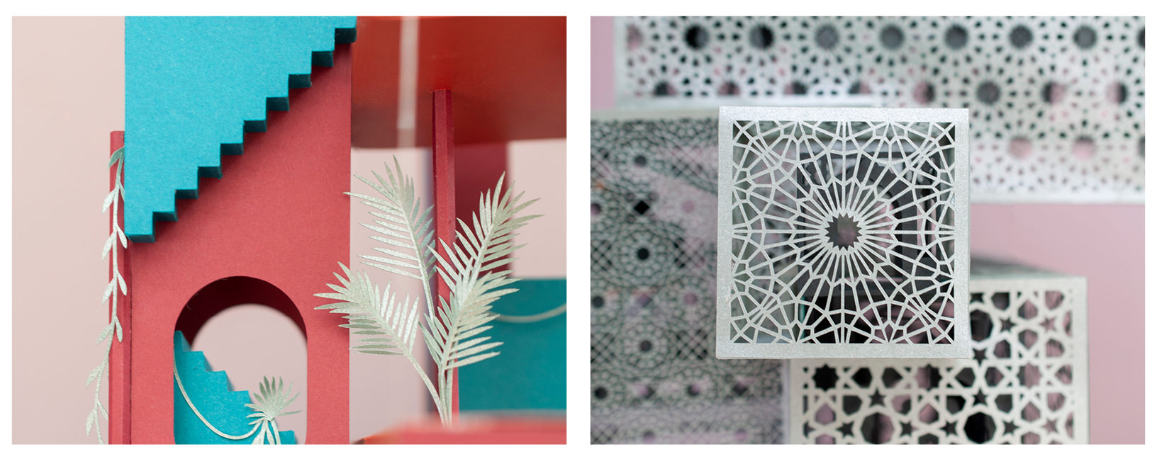
For SAORI, it was L’Institut du Monde Arabe, Royal Mansour in Marrakech, Sakura House by Mount Fuji Architects, Do Ho Suh architectures, Islamic and Indian block-printing, Hawa Mahal in India.
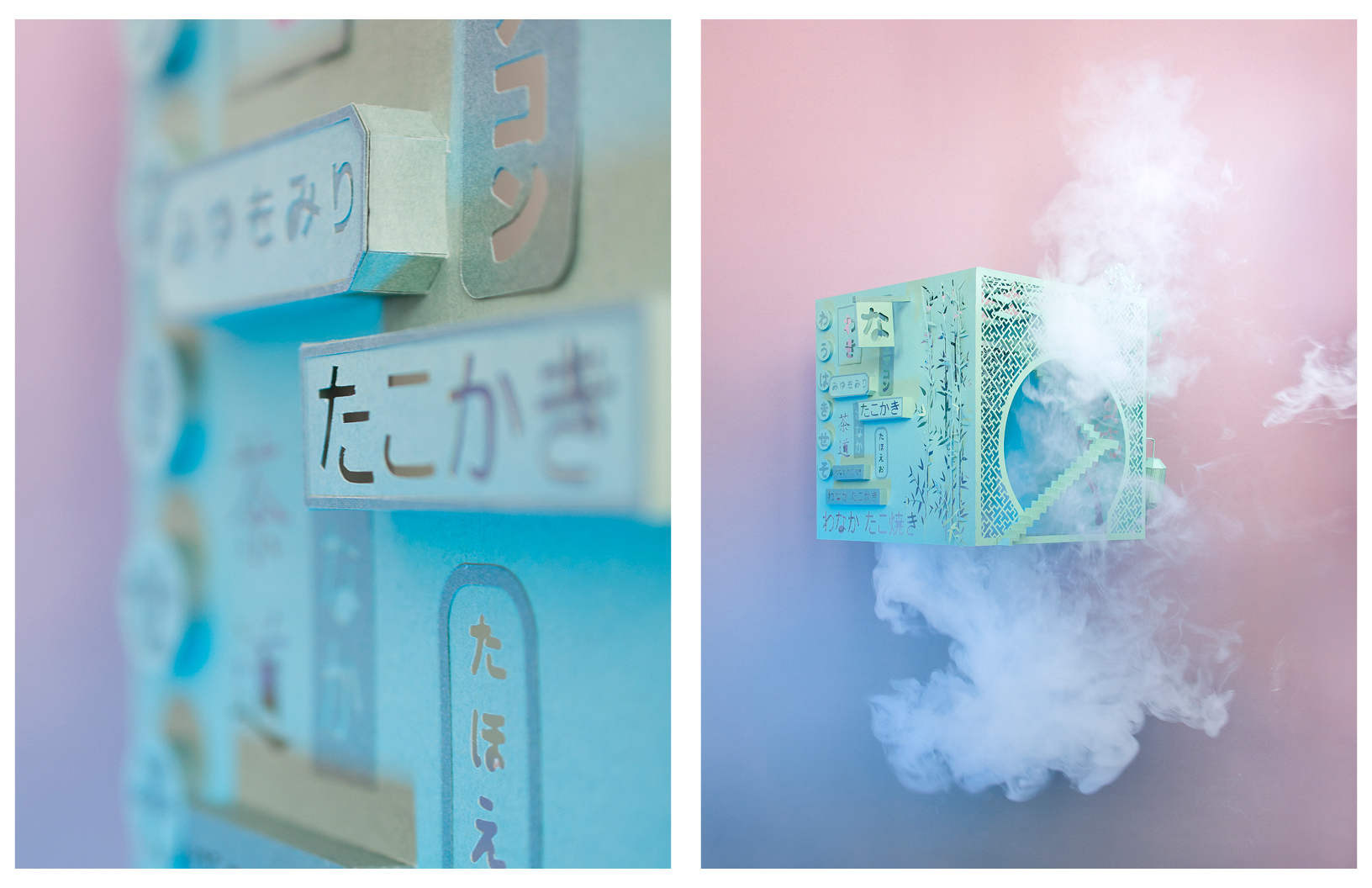
For IKA, Rachel Whiteread’s art, movies and Memoirs of a Geisha, Tokyo’s nightlife, Collage House in Mumbai by S+PS Architects, the book In the Praise of Shadows by Jun’ichirō Tanizaki
For CALISTA, Ricardo Boffil’s La Muralla Roja, Edward James’ Las Pozas in Mexico, the videogame Monument Valley, Escher drawings, Buena Vista Social Club music.
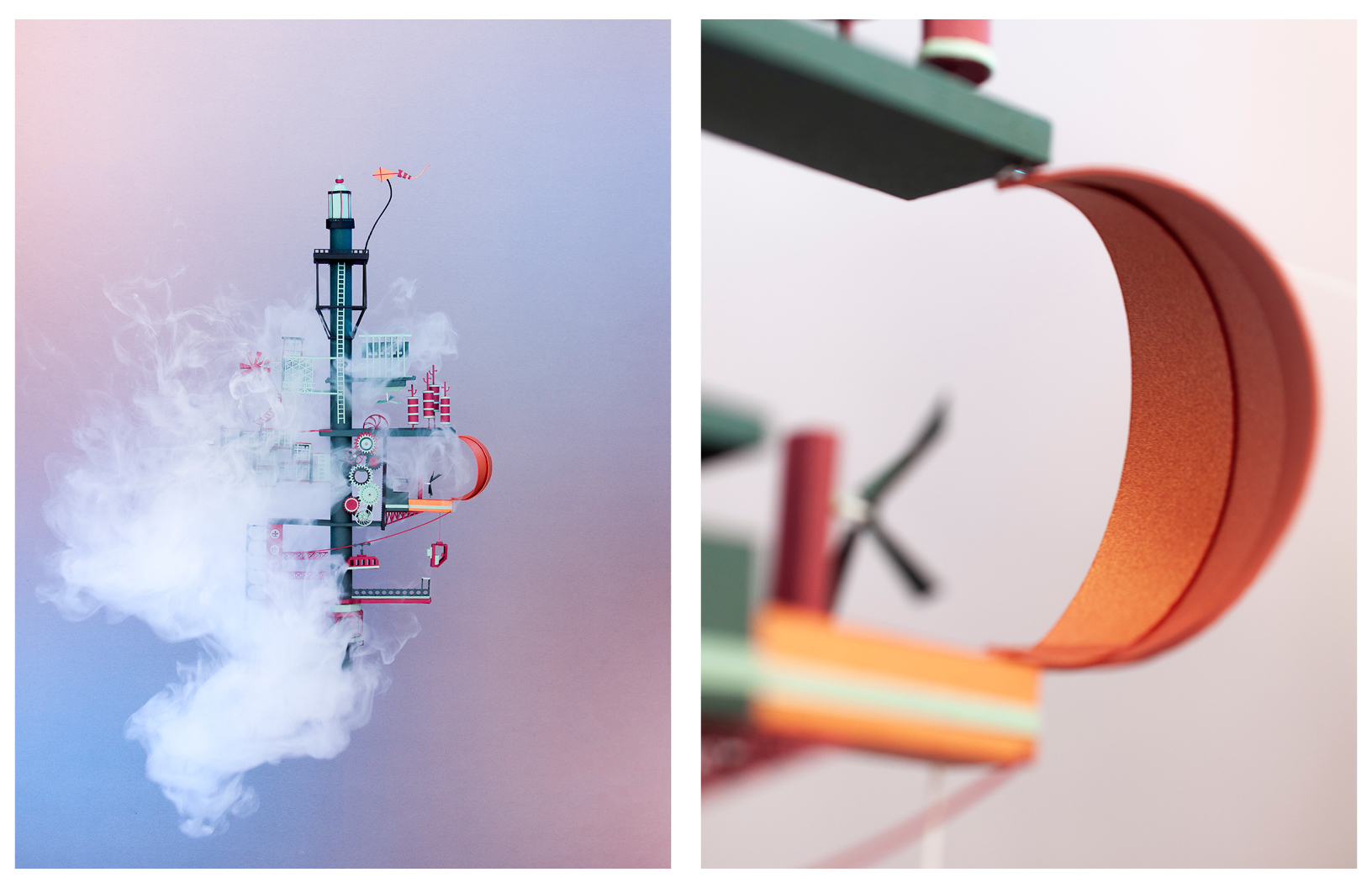
And finally AZRA, Xabier Corberó’s house, Parc de la Villette (Paris) by Bernard Tschumi, Centre Pompidou, New Concordia Warf by Pollard Thomas Edward architects, Jules Verne drawings, offshore oil platforms.
Because these are cities, I imagine it was important that this was a collaborative project. How did you push each other conceptually to arrive at the final pieces?
Our initial goal was to freely express ourselves in a purely artistic and experimental way. We wanted to explore where the combination of our digital and craft skills would lead us in terms of scale, detail, colour, etc. The book offers several interpretations of both the meaning and aesthetics of each city. We thought it would be interesting to play with that.
For example, when thinking about Calista’s design, each one of us was inspired by a different part of the book. We took inspiration from the dream tale told in Zobeide: “Some men, one night, had the same dream. They saw a woman running at night through an unknown city; she was seen from behind, with long hair, and she was naked. They dreamed of pursuing her. As they twisted and turned, each of them lost her…” and from a quote in Esmeralda: “[…] the shortest distance between two points in Esmeralda is not a straight line but a zigzag that ramifies in tortuous optional routes, the ways that open to each passerby are never two, but many.”
Using this method, we created unique cities by combining our individual interpretations of different passages from the book and hid our own messages to the viewer within the architecture. The most important thing for us was to try to combine our two styles and create something unique.
The cities obviously took a lot of time to create, given the painstakingly detailed work that went into the models. What was something that changed over time that became part of the final presentation?
In the beginning, we couldn’t decide on whether to use universal architectural elements – that everyone could relate to – or explore specific ones for each city – to give an origin and identity to each one. It took us a few days to realise that it would be more interesting to make each city unique, and create a visual world map through the use of local symbols.
It then took us two days of trial & error until we finally found a way to combine our styles to work in a single city, creating elements that could be put together like a 3D puzzle. For example, for Calista, we started designing a catalog of elements, which we then created and rendered in 3D, and finalised by creating 2D paper pieces that we could assemble until we were satisfied with the results.
When you guys state how you wanted to explore “opulence, lightness, the negative space, and fragility” with this project, opulence seems unlike the others. Why was this aspect still important to the project?
Our cities were particularly inspired by the descriptions of rich architectures, and the human perception associated with them. Opulence can be expressed through the use of complex patterns, intricate elements, or strange architectural combinations. We wanted viewers to be able to discover new elements as they look deeper into each city – in order to constantly discover new layers of content. Our cities are full of small references from world cultural heritage. We wanted something that could express a rich visual stimulation for the viewer to engage with the project actively.
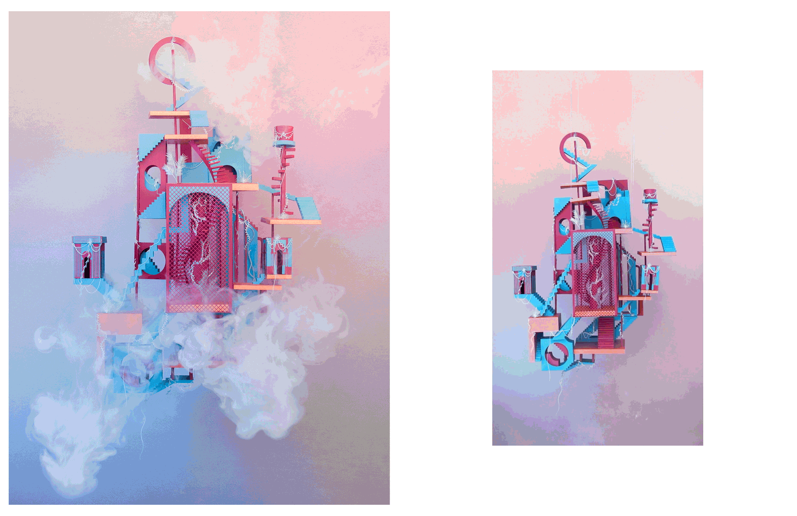
I found Saori particularly interesting in terms of its disorienting effect. It was guarded yet porous. It was very dense and the least open to (or revealing of) movement compared to your other cities. Why was this city so different from the others? Was there a particular reason?
This city is mainly based on the concept of opulence, which makes it complex and very rich compared to softer concepts such as fragility. We wanted to explore as many possibilities as possible in terms of scale, colour, complexity, rigidity, etc. Saori was a challenge for the simple reason that it is composed of two structures, one inside of the other. The inner structure is based on oriental architecture and the outer one on the patterns that can be found in this civilisation.
To convey a sense of mystery, we used cultural heritage elements like the mashrabiya, from Islamic architecture, and buildings like the Hawa Mahal in Jaipur, India. This type of patterned facade allowed the royal ladies to observe everyday life, and festivals celebrated in the street below, without being seen. We were fascinated by the idea of seeing without being seen and giving the viewer the feeling that something is happening on the inside, although they can’t perceive it. That is where the idea of the inner city and the outer shell was born. In that sense, Saori is more magical than the other cities. With front lighting, the viewer can appreciate the patterns in the shell, and with backlighting, the city will reveal what she hides inside.
There seems to be oriental, foreign elements in some of the cities. Was that because of the source material — Marco Polo’s travels — or something else?
All the cities have different cultural elements ranging from Islamic architecture for Saori, to Japanese references for Kia. The elements are based on the cultural discoveries of Marco Polo but adapted to suit each of our cities according to what they evoked in us. Furthermore, visual references we were consuming at that time, and the music we were listening to, also influenced our work. For example, Calista has a Cuban influence (colours, shapes, architecture…) because we were listening to Buena Vista Social Club when we created it. The colours and the style of this city are thus influenced by our mood and this music.
In today’s world, nature is taking back its rights. This is what we wanted to illustrate for the city ‘Calista’, influenced by Edward James’ las Pozas where vegetation has a fundamental role and gives new meaning to the architecture. It was important for us to convey our ideals through this project. Dreaming of a greener world, we populated this city with vegetation that is taking back its rights. The spectator can, therefore, imagine a life in harmony between people and nature or an abandoned city. The interpretation belongs to the spectator.
For Azra, the main concept is weightlessness. From this, the idea of a floating city came. It is around a main axis that the city unfolds, horizontally or vertically, but always in such a way as to allow the composition to breathe. Mixing industrial structures and machinery that can be compared to a Jules Verne ship.
In SAORI, the patterns create a mysterious facade that allows the viewer to sneak through it, and observe its interior like a voyeur. The goal was to create a certain perplexity in the viewer by making him/her feel observed. IKA is about the negative space and a game of light and shadow, present in Japanese architecture. There are some tea house reminiscences as well as some references to Tokyo’s nightlife. By using a single colour, the viewer plays an active role in determining what type of ritual is taking place in its interior.
I was struck by the absence of people in the final renderings. What was the reason for this? Was this a limitation of architecture models or are you perhaps giving the viewer the task to populate the cities in their minds?
All the pictures we have shared are pictures of the model, not renders, although they might look like! By populating the cities, we felt like we would be stating how they should be inhabited. Our goal was precisely to leave that door open for interpretation, just like in the book. The cities are objects of contemplation, and by sneaking through the patterns, or small windows, every person can recreate a different story, a different experience. If we had populated the cities we would be stating that the sculptures are indeed only cities, and hence limiting the possibilities. However, by leaving them uninhabited, they can be read as art pieces, contemplative objects, or small architectures. Knowing that these cities are imaginary, their populations could also be imaginary, and leaving this choice to the spectators was a desired effect.
All of your cities are very helpful initiators to explore our inner worlds. Should we accept our experience with your piece as immaterial or try to actualise our daydreams?
With this project, we wanted to create spaces that could inspire dreaming and intellectual travels. As adults, we often forget the importance of dreams and imagination. With these cities that have come out of our imagination, we hope to stimulate the imagination of the viewer. Imagining how they can be populated and inhabited is a good start to find our infant souls, which allows us to travel through imaginary worlds during difficult periods like this. It’s an open door to dreams for the public as well as for us! As Calvino used to say, cities are trading places, not only for commodities but also words, wishes and memories. Similarly, we wanted the viewers to find a space to trade dreams.
How can the cities that we live in and the public space that we share be more like the cities you have shared with us?
We are both foreigners in London, and we realised that we had started to forget the beauty of our hometowns. It wasn’t until we returned that we fully appreciated how beautiful our hometowns are. These cities are new to our eyes, so they allow us to dream and imagine, but we must not forget that the architecture we see every day is just as beautiful and an open call for imagination. You only have to open your eyes to see beauty that has become overlooked!
It is indeed the viewer who defines the architecture around him. To describe Zemrude, Marco Polo says: ‘It is the mood of the beholder which gives the city of Zemrude its form. If you go by whistling, your nose a-tilt behind the whistle, you will know it from below: window sills, flapping curtains, fountains. If you walk along hanging your head, your nails dug into the palms of your hands, your gaze will be held on the ground, in the gutters, the manhole covers, the fish scales, wastepaper. You cannot say that one aspect of the city is truer than the other, but you hear of the upper Zemrude chiefly from those who remember it, as they sink into the lower Zemrude, following every day the same stretches of street and finding again each morning the ill-humor of the day before, encrusted at the foot of the walls. For everyone, sooner or later, the day comes when we bring our gaze down along the drainpipes and we can no longer detach it from the cobblestones’.
The idea of humans shaping and defining their physical spaces really interests us. Indeed, it is our perception and acts that define the nature of our cities. Our intention is to invite viewers to reshape their own cities by rethinking the way in which they look at them.
What are you most looking forward to from London once the pandemic is under control and “behind us”?
In relation to this project, the end of confinement is something we are really looking forward to. This project can, for the moment, only be admired through a screen but we think it is important to see the sculptures in real life and interact with them. Moving around these cities provides a chance to understand their complexity. The cities are paper sculptures, but they have now become objects of contemplation for us. We would like the project to grow and to share it with the rest of the world with the aim of finding potential artistic collaborations. Our first idea was to have the project exhibited because if there’s something wonderful about the art of paper it’s seeing the reaction of the viewer and they discover that the sculpture in front of them is made of paper.
Another option would be to make them on a larger scale in another material, like metal, to ensure an eternal life. In short, it started as an artistic experiment but we are ready to advertise and commercialise when we find interesting collaborations. The most important question to reflect upon the following confinement, is ‘what we have learned from this pandemic?’. As the confinement is slowly lifted we are rediscovering the nature of London. I think we had taken the beauty of nature for granted and this pandemic allowed us to rediscover it through the simple joys of cycling in fresh air and sitting on grass. We hope that this awareness will be the same for everyone!
This Schön! online exclusive has been produced by
design, production + photography. Camille Benoit + Mariana Gella
words. Dayoung Lee
Schön! Magazine is now available in print at Amazon,
as ebook download + on any mobile device