The theme for the 61st edition of ModaLisboa was ‘à la carte’, which President of the Associação ModaLisboa Eduarda Abbondanza described as “a menu of design, creativity and sustainability”. There were panel talks with titles such as ‘Eat your Greens’ and ‘Spill the Tea’, tackling subjects from technology and innovation to ‘brand building in the age of oversharing’. The starter was an exhibition, the house specials the catwalk shows and for dessert… well, a closing party of course. In between, ‘palette cleansers’ included installations, presentations and brand pop-ups.


Diogo Mestre | Sangue Novo
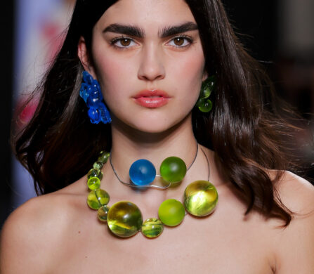
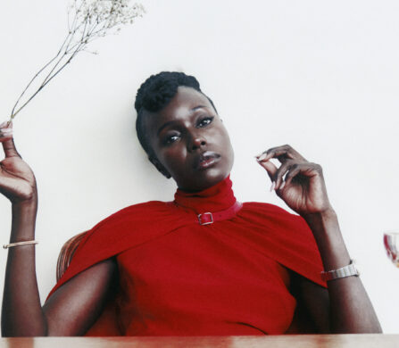
Lisbon’s fashion week has always showcased a range of designers, from recent graduates and emerging talents to bigger labels and established brands, but one thing that united most of the collections in this edition, which took place earlier this month, was the use of bold colour. In some cases, there were shots of vibrancy interspersed with more neutral tones and, in others, colour was undoubtedly the main course.
If nutritionists advise that, for optimum health and vitality, we think of our plate as a rainbow, then perhaps we should think of our wardrobes in the same way. Read on for a delicious dose of fashion fare.


Ana Maricato | Sangue Novo
So, what was on the menu at Ricardo Andrez? Well, clearly not cornflakes, as his collection was called I Don’t Eat Breakfast. Andrez referenced the early 2000s, diet culture and “the dichotomy between sophistication and sensationalism. More is more.” Raspberry, watermelon and blood orange saturated many of the garments, often in wide stripes reminiscent of candy canes, and contrasted with stone washed denim, sometimes in acid yellow, while more muted fabrics were given a pop of colour in the form of fluorescent accessories.


Ricardo Andrez
For her streetwear brand DuarteHajime, Ana Duarte took a step further back in time, specifically to the games arcades of the early 1970s, a time when “humans had control over technology”. Inspired by 8-bit games and a pixelated aesthetic, Duarte presented a genderless collection of oversized silhouettes in organic cotton, denim, recycled polyester, wool, Bemberg™, sports nets and technical fabric ReLiveTex®. The palette was composed of aqua, mint and lava red, against a foil of black and white. Duarte is also a professional illustrator, with five published books, and exclusively creates the prints in each of her collections.


DuarteHajime
We don’t know for sure what Dino Alves’ collection was about because he didn’t tell us (dubbed the ‘Enfant Terrible of Portuguese Fashion’, Alves is also known for not being too fond of the fashion press), but we suspect it had something to do with production processes, from cutting to tailoring to embroidery. Cut outs on t-shirts, shirts and skirts revealed a garment within a garment, dresses were accessorised with embroidery hoops and sheer, voluminous skirts were reminiscent of petticoats and crinolines. Primary red was a dominant colour, but there was also cantaloupe, vermillion, gold, turquoise, rose, aqua and lemon, contrasted with solid black.


Dino Alves
Nuno Baltazar, one of the more established designers at ModaLisboa, was influenced by the documentary Paris is Burning. He described his Ballroom collection as “a party in which each protagonist is invited to build their own character”. As such, paillette knits played the protagonist, structured taffeta the antagonist, with georgette crepes, dupion moiré and wool as the remaining cast. Softer shades such as lilac, aqua, sand and smoke provided supporting roles to hot pink, claret, terracotta, chocolate and silver.


Nuno Baltazar
Another established designer, Mozambique-born Carlos Gil, also took inspiration from night life, but this time the extravagance of London’s burlesque scene, an atmosphere that he says “stimulates the imagination, creates fetishes, arouses curiosity and inspires women”. In a collection titled Believe It, tailored silhouettes were embellished with fringes, feathers, jewels and glitter. Turquoise, indigo, scarlet, cerise and egg yolk yellow were splashed in painterly, fluid prints across silk, used in feather trims, embroidered onto sheer dresses or represented head-to-toe or in colour blocking on tailoring.


Carlos Gil
One never knows what to expect when Lidija Kolovrat presents a collection, as she believes in continuously reinventing her brand to reflect the dynamic community that she is part of. Her latest inspiration came from a trip to Cuba, a country that she found “as rich as it is poor”, and where she was struck by “the lack of practically everything – the sparse tobacco plantations, bankrupt companies, empty roads”. Returning to ModaLisboa after a brief hiatus, Kolovrat impressed us with one of her strongest collections to date. The colours of Cuba’s “old Chevrolet cars, colonial palaces, the typical bodeguitas” were reflected in original prints. Voluminous silhouettes and oversized, multi-functional pockets were contrasted with tighter fits, and light fabrics such as silk and crepe with cotton and heavy twills.


Kolovrat
As well as the designers on the main catwalk, ModaLisboa champions emerging talent through its Workstation and Sangue Novo platforms. The latter is a competition for fledgling designers, ten of which showed this season, and six of which were selected as finalists to compete at the next edition for awards from the Instituto Europea di Design (IED) and RDD Textiles. With younger designers, one can expect more experimental and less commercial creations and therefore a wide range of concepts, materials and techniques. However, yet again, bold colour was in evidence in several of the collections, including those from Ana Maricato and Izabel Monnerat, and finalists Diogo Mestre and Maria Do Carmo Studio, proving that the future of Portuguese fashion is looking bright.


Izabel Monnerat & Maria Do Carmo Studio | Sangue Novo
Read more about ModaLisboa here.
words. Huma Humayun
photography. Ugo Camera