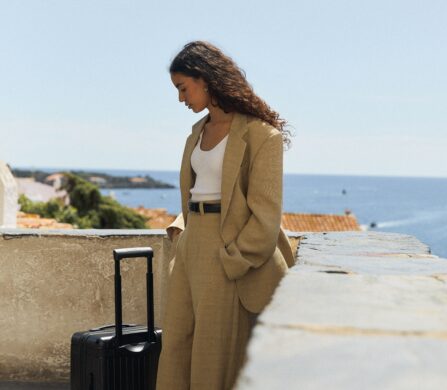
When people speak of a whirlwind trip to Europe, it’s not often that Berlin is typically included on the same list as London, Paris, and the like. Although Berlin might not be at the top of everyone’s must-travel-to list, it is the place where art aficionados and tastemakers come together and thrive. This ethos is no better embodied in Locke‘s latest Berlin property, Locke at East Side Gallery. The first property in the city and third in Germany follows the success of WunderLocke in Munich and Schwan Locke, boasting 176 modern studio apartments carefully designed by Matthew Grzywinski of Grzywinski + Pons.
As Locke was born out of the idea that being away from home means that life should continue seamlessly, each space within Locke at East Side Gallery is as functional as they are creative. Creating a home-to-hotel can be difficult — where many hotels and aparthotels can feel cookie-cutter, Locke’s series of aparthotels always feel like they are a part of the city’s DNA, embedding themselves into the culture of the place where they are homed.
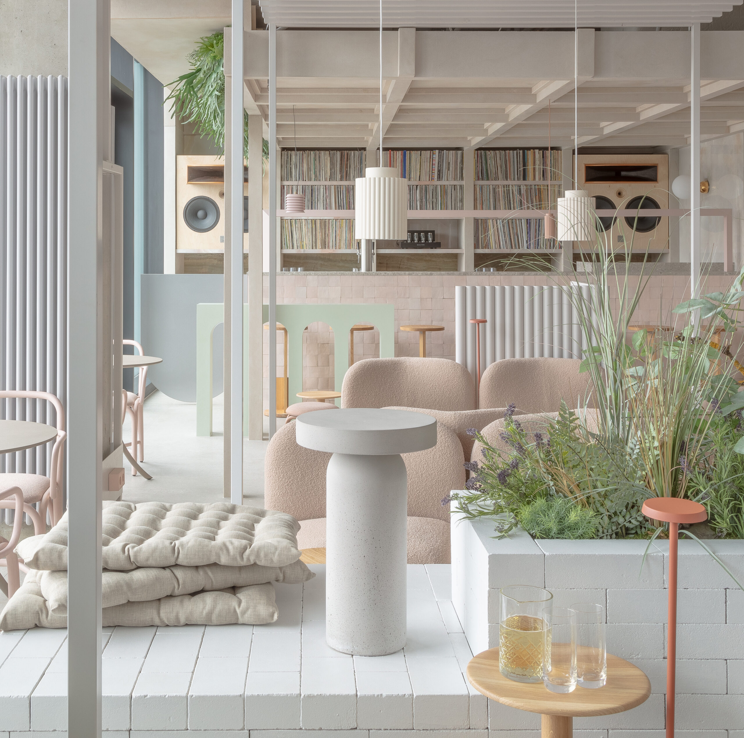
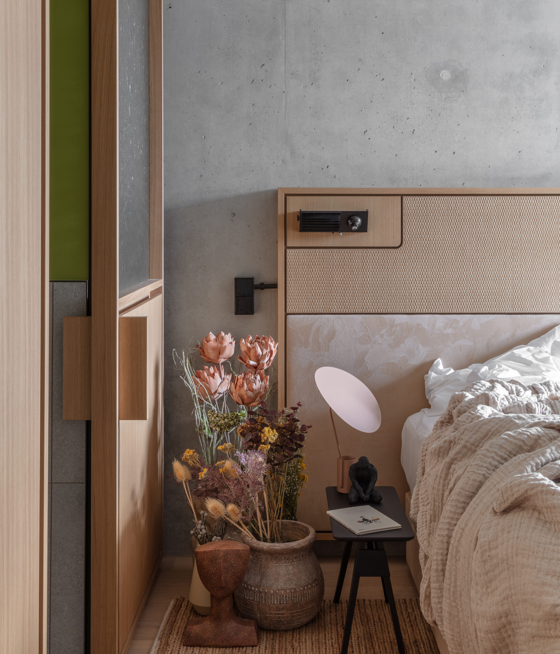
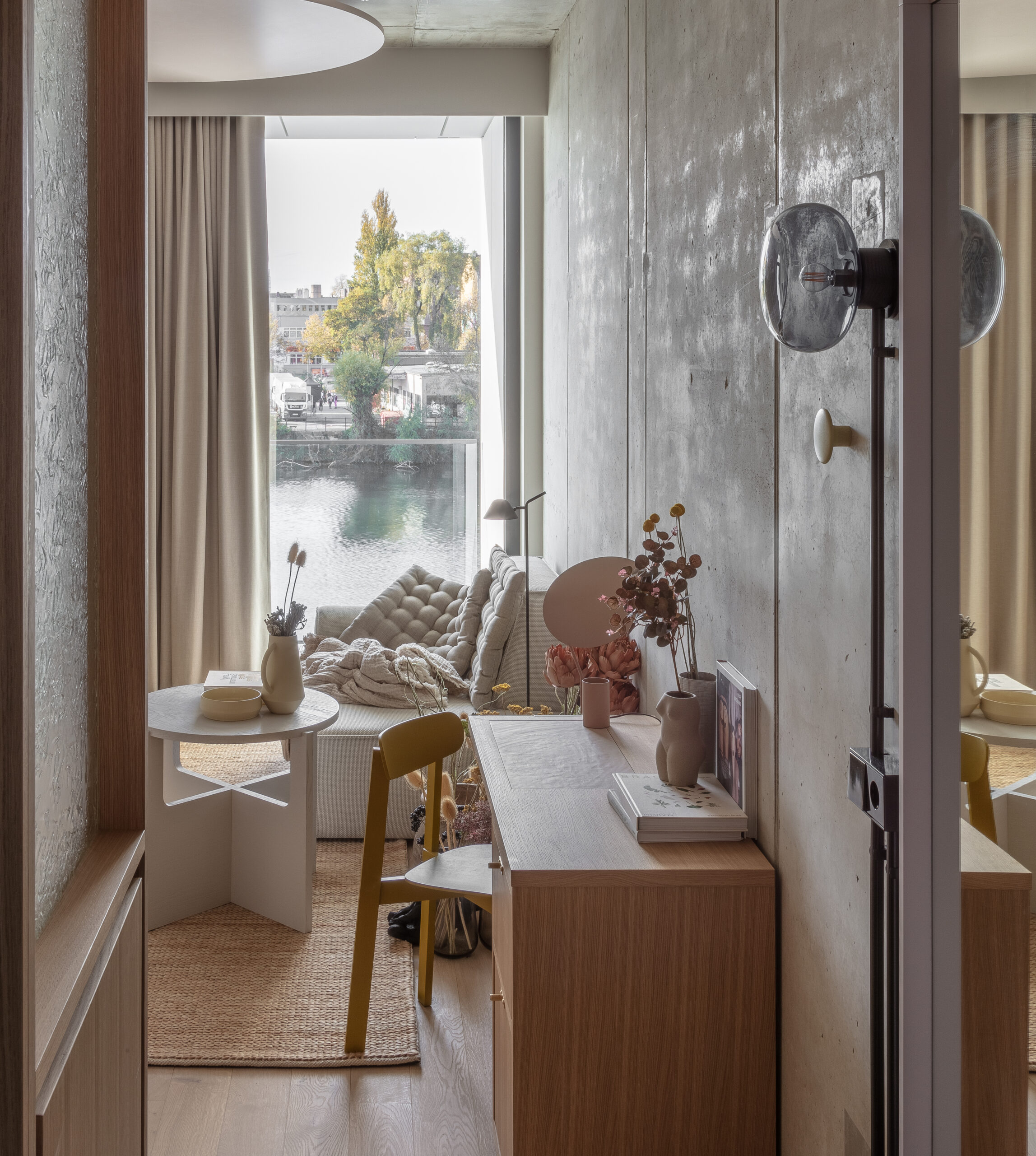
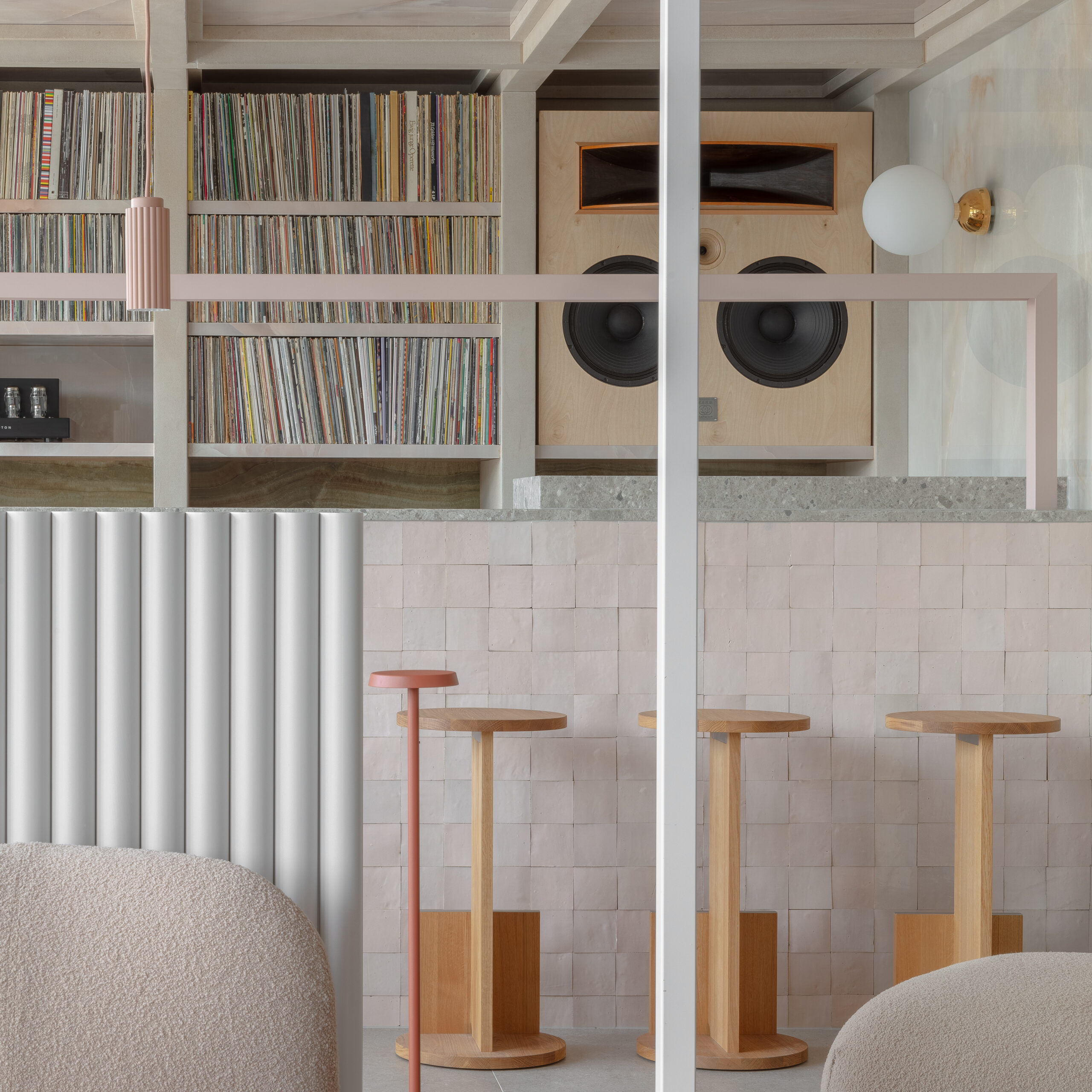
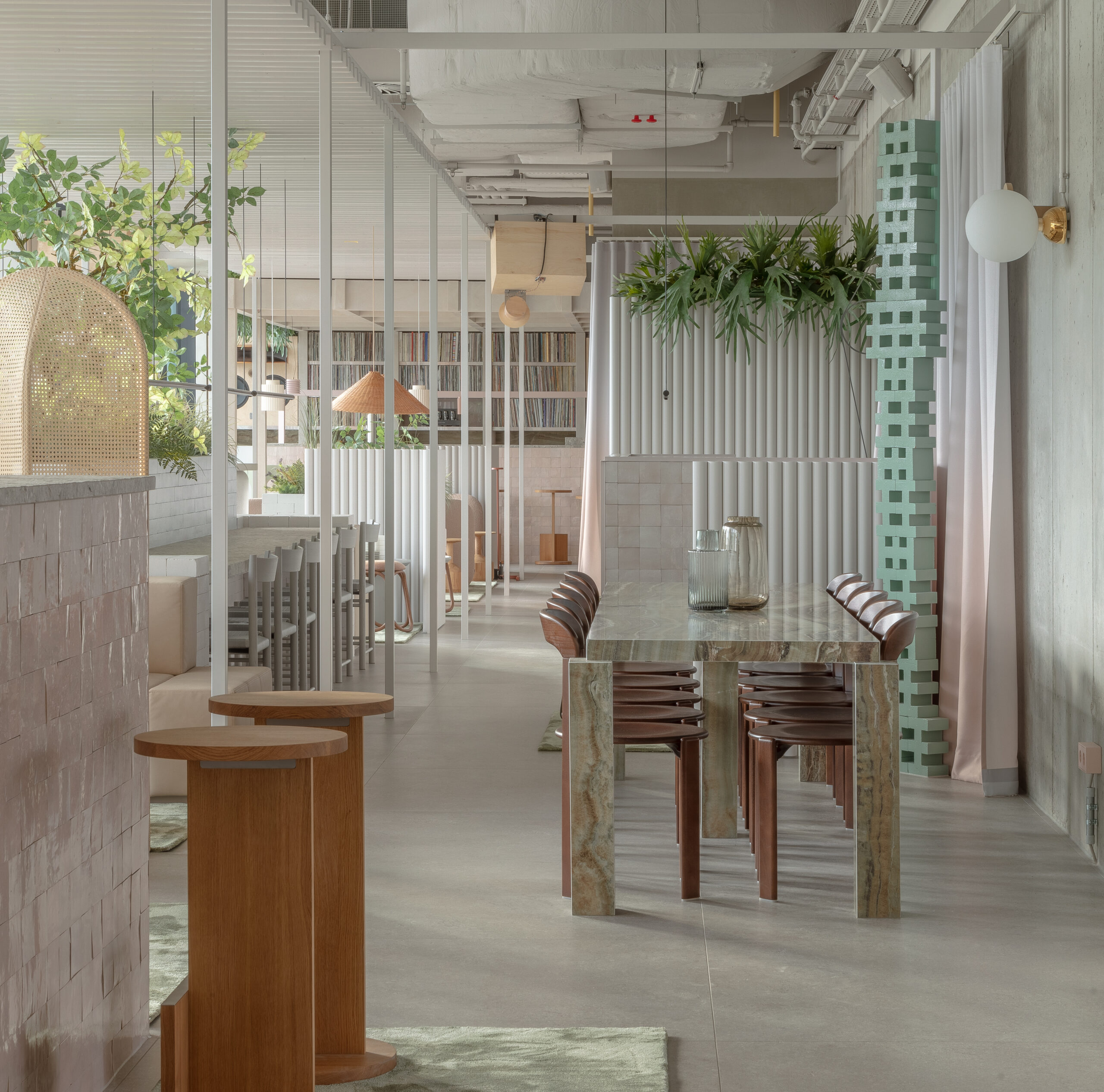
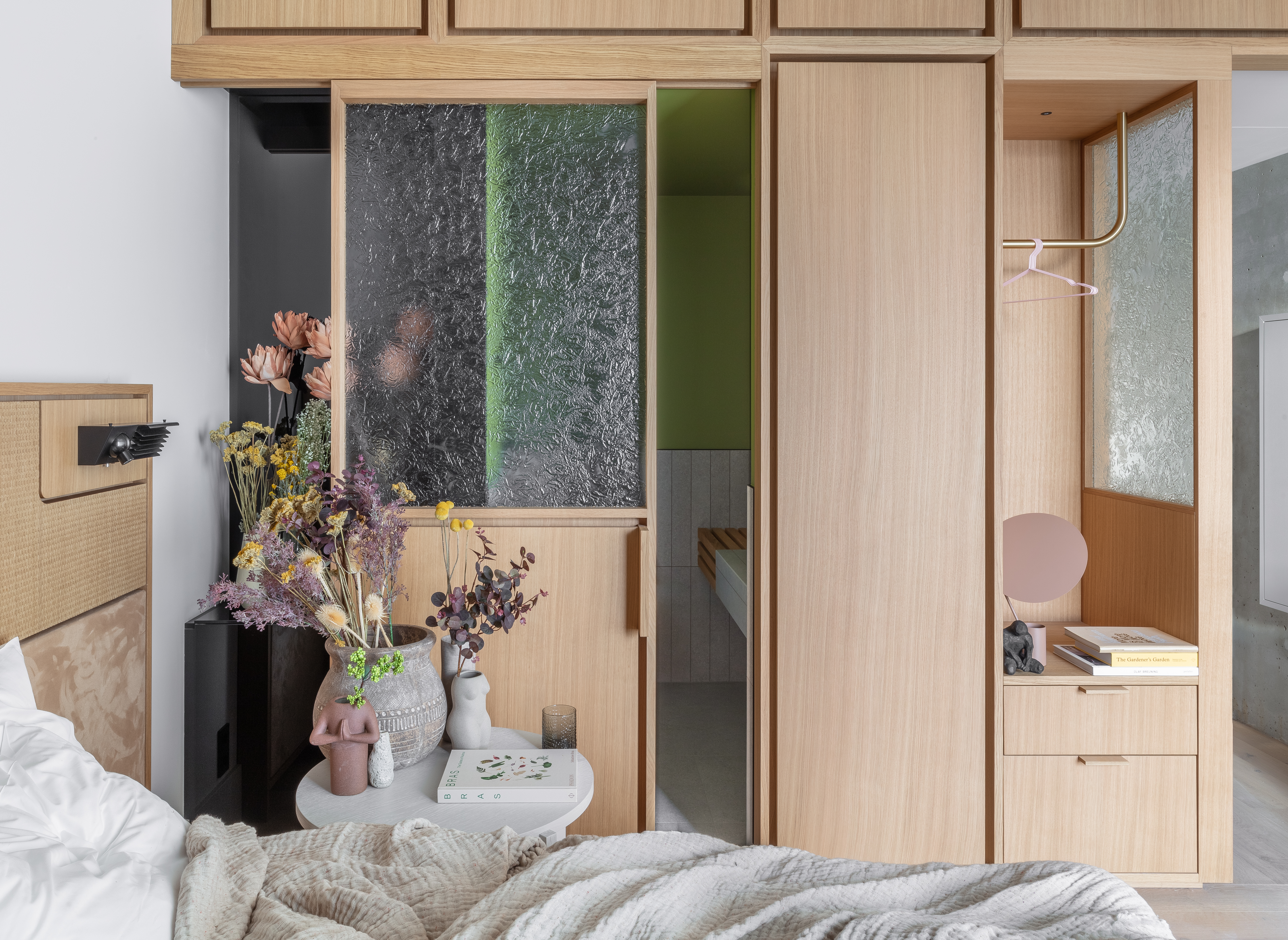
Crafted and thoughtfully designed by Grzywinski, Locke at East Side Gallery embodies the essence of its microlocality, integrating features such as the historic Berlin Wall, the serene River Spree, and adjacent parks into its design. The residences feature an elegant palette of neutral hues, organic textures, and exposed concrete complemented by lively bursts of colour. Reflecting the area’s artistic heritage, the communal areas on the ground floor evoke the ambiance of a gallery, honouring the vibrant surroundings of the building.
Schön! chats with Locke’s designer Matthew Grzywinski about crafting the space, what aspects of Berlin are woven into the hotel, and more.
What inspired the choice of color palette and materials in the hotel’s interiors? How do these choices contribute to the guest experience?
I think a lot about light and how one might feel in a space when it comes to texture, scale and color. Texture is useful visually in amplifying directional light, and I try to employ texture to provide comfort and warmth in spaces or, conversely, contrast that with sleek or glossy surfaces. Colour for me is more intuitive. At Locke at East Side Gallery, I wanted the rawness of the public spaces to be largely neutral and monochromatic, even industrial. For the furnishings and some of the installations within that volume I introduced colour (and texture) that hopefully was harmonious. Blush, mint, buff – powdery tones that I thought were a nice foil. Kind of like a meadow in a battleship. The wall curtains literally transitioned from grey to blush with an ombre print.
What role does local culture and heritage play in the design of these hotels, and how do you incorporate these elements into the interiors?
The inspiration for this project for me was all about context. Not trying to fit it, but being inspired by it. Our setting at East Side Gallery was instructive. The same structure that was built to divide and restrict is now a magnet for interaction and expression. What better inspiration could we hope to guide our own architectural pursuits? The Berlin Wall today, both as a memorial and a cultural asset, is the edification of a global paradigm shift. Its power centres on intersection, not exclusion. In our aspiration to create a convivial venue within such a storied context, we conceived the hotel as a liminal space — a place for exchange, a crossroads for ideas and experiences. The interiors are intended to foster that exchange even while providing a home base for visitors and locals.
Can you share any specific design elements that were custom-made for Locke at East Side Gallery to make it unique?
We custom designed almost all of the furnishings in the hotel and had them fabricated expressly for this project. From the bedheads, screens and sofas to the joinery, tables, mirrors and desks. In addition to utility, a lot of the pieces were imbued with some site specific meaning. For example, the series of glass screens and doors in the rooms reference the Spree. The Spree is pretty placid river, and the light reflecting off of its gently textured surface is a major component of the views from the hotel. We had bespoke kiln glass made for the glass panels in the rooms that have the same character as the river surface in grazing light.
How did you integrate sustainability and eco-friendly design principles into the hotel interiors? Can you highlight any specific sustainable features?
In addition to architectural measures like energy efficiency, passive heating and cooling measures, “smart” building systems etc, we also thought a lot about not over furnishing spaces and using renewable materials wherever possible. We also thought about durability in our specification as well – the most sustainable material is the one you do not have to replace. This is of particular concern in a hospitality context.
How do you address the evolving needs and preferences of guests in the design of the hotel spaces, especially in the post-pandemic era?
I think the two most concrete changes I have noticed with regard to guests’ needs in the post pandemic world have to do with remote work which influences both length of stay in a hotel and the desire to be able to work from a hotel productively. Our work on this and other Locke properties in particular has allowed us to explore incorporating the conveniences of home (being able to cook or order in and eat comfortably) and the office into a hotel without sacrificing the aspirational and celebratory nature of a hotel stay.
In what ways do you create a sense of continuity and a ‘signature style’ while also allowing for unique elements in each individual hotel within each Locke hotel?
I feel like there is more danger of repeating ourselves – that design continuity, particularly with the same programmatic constraints, is the easy part. Maybe even autonomic. So I try to approach each Locke (and all projects) with a totally open mind and a sincere excitement and curiosity about the context in a both macro and micro-local sense. By also utilizing local materials or building typologies, the properties reflect their setting further though interpreted through my lens – that of an admiring “outsider”.
What is your favourite design element or area within Locke at East Side Gallery, and why?
I am happy with a lot of it but I think spending time in the rooms especially on the Spree side was really comforting. There is an assembly that incorporates a lot of the materials in it that have contextual meaning (kiln glass referencing the spree, black glass referencing the private and inscrutable nature of Berlin, oak and larch veneer from the forests surrounding the city etc) that also compactly addresses many practical needs within the room.
Learn more about Locke at East Side Gallery at lockeliving.com.
words. Kelsey Barnes